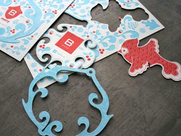
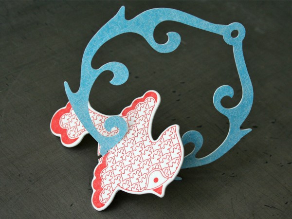
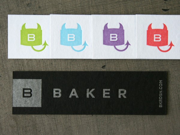
We’ve worked with BAKER here in Minneapolis on a few really fun letterpress projects over the last year or so. And they’ve designed some beautiful things for pressing. Most recently, their second installment of the bird themed holiday ornament cards rolled off the press. It is a little bird (a good luck Cardinal) with an ornate frame that die cuts and punches out of thick 60 point blotter stock. It is printed two color each side.


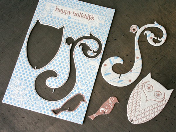
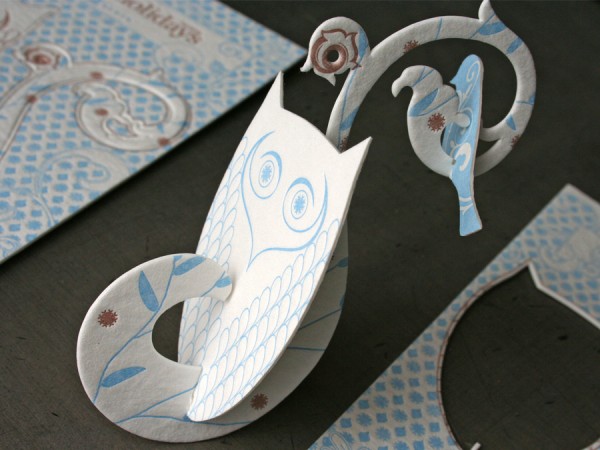
Last years card for Baker was a die cut bird ornament as well. The same production specs, but featuring a punch out owl.


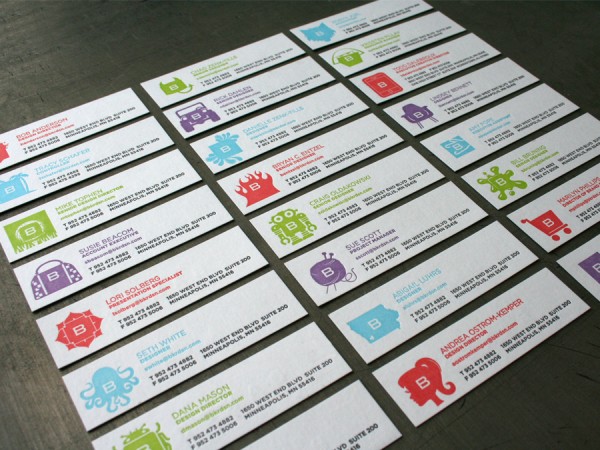
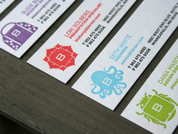
Also in the last few months, we worked through the letterpress printing of the new Baker identity on their business cards. And is was quite the undertaking. They have an interesting post about the process of icon development here. Each employee has their own icon and each card has four color ways. With over 60 employees that was a lot of icons and business cards! They are a custom duplexed 200lbC black and white stock in an undersized narrow card format. (1 x 3.5 inches) BAKER is printed in silver on the black side and the white side receives the four different color variations.

BAKER is a Minneapolis based Branding + Design firm specializing in package design. On the web: bkrdsn.com or tweet: @bkrdsn
Published on
December 20, 2010 in
Business Cards, Holiday and Letterpress.
Tags: 100lbC, 60pt, ahlstrom, baker, baker associates, birds, black, blotter, blue, business, Business Cards, cards, coaster board, coaster stock, coasters, color ways, custom, cut out, cute, cutting, die, diecut, duplex, eclipse black, green, hanging, heavy, Holiday, Letterpress, narrow, ornament, ornate, owls, pasted, printing, punch out, purple, red, thick, wausau.
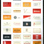
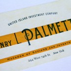
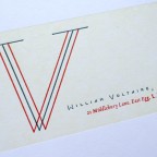
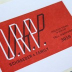
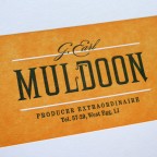
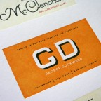
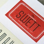
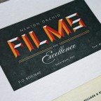
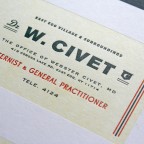
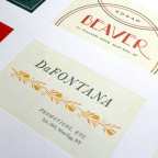
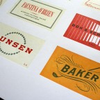
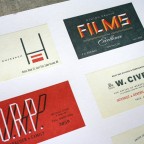
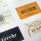
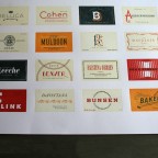
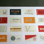
Heads of State designed this F. Scott Fitzgerald inspired poster, capable of bringing tears of joy to English teachers and designers everywhere. It is an epic layout project containing 32 calling cards of fictitious Great Gatsby characters. Each card is its own nugget of typographic excellence modeled after 1920′s social stationery.
This was an ambitious letterpress printing. (did we mention 32 card designs up on a sheet) With its large size, four ink colors, full dry back between each color, tiny type plus full solid areas, tight register and heavy stock this took some patience on press. We printed on French Poptone Sweet Tooth 140lb C - a massive 20 x 26 press sheet trimming down to the final 18 x 24 inch poster.
The poster is for sale at the Heads of State store
You can also check out our post on previously printed business cards for Heads of State.

Published on
December 15, 2010 in
Business Cards, Letterpress and Posters.
Tags: blue, Business Cards, calling cards, fitzgerald, great gatsby, heads of state, heavy, heidelberg s, ink, large, Letterpress, navy, orange, poster, press sheet, red, social, solid, solids, stationery, tonal, type, typography.
Since pretty much everyone needs a paper saw blade, we figured it was time to deliver. These heavy duty paper blades pop out of our latest promo card to fly through the air as a dangerous incarnation of business cards. You can toss them at pets, logs and trees, use them as coasters or keep them on hand to contact us for your next custom letterpress printing project.
(these are an upgrade from our previous ninja version)


Published on
October 19, 2010 in
Business Cards, Design and Letterpress.
Tags: 200lb, bright white, Business Cards, calling cards, coasters, craftsman, custom, die cut, diecut, dieline, heavy duty, let er rip, Letterpress, orange, paper, printing, red, saw blade, spin, thick, throwing stars, tongue in cheek, toothy, wausau.
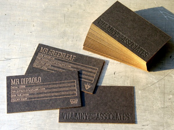
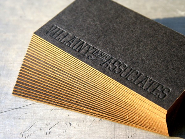
These cards designed by Villainy and Associates really make you stop and turn the thing over in your hand. The understated typographic design gives the letterpress production value emphasis. It’s simple and pseudo executive - flashy without being too flashy.
We printed letterpress metallic gold for the information and letterpress varnish on the logotype. We like using a varnish on dark stocks for a tone on tone effect. That gives a slightly better legibility than a totally blind, inkless impression. The stock is a thick 200lb Wausau Eclipse Black with metallic gold edge coloring.


Published on
October 12, 2010 in
Business Cards and Letterpress.
Tags: black business card, blind, crafted, eclipse black, edge coloring, edge staining, edge tipping, executive, gold edges, gold ink, heavy, impression, LA, Letterpress, los angeles, new york, NY, paper, thick, tonal, tone on tone, type, typographic, typography, varnish, villainy, villainy and associates, wausau.
Just launched this last week was the 26th version of the Space150 identity. These guys change up their identity every 150 days. They designed this business card with lots of production love. Here are the production steps:
1. Custom pasted triple layer stock. Black with a white middle, 330lb total weight.
2. Black foil on the logo side
3. Letterpress printed metallic ink on the info side
4. Die cut with little “snake bite” marks
See previous Space150 card versions we’ve printed here and here and here.


Published on
September 24, 2010 in
Business Cards and Letterpress.
Tags: black, business card, Design, die cut, die cutting, duplex, foil, heavy, layer, Letterpress, metallic, minneapolis, paper, ply, snake, space150, stock, thick, three, triple, triplex, v26.
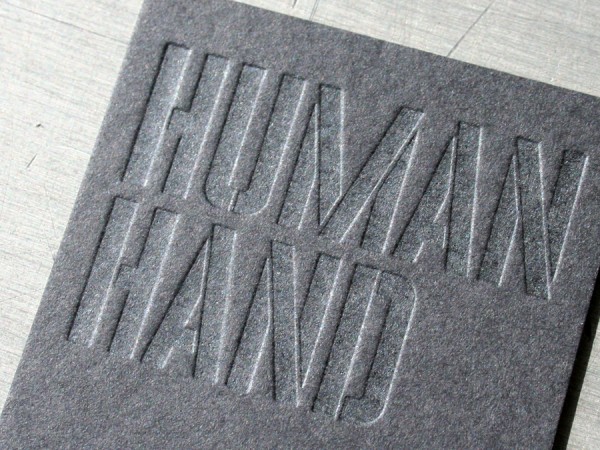
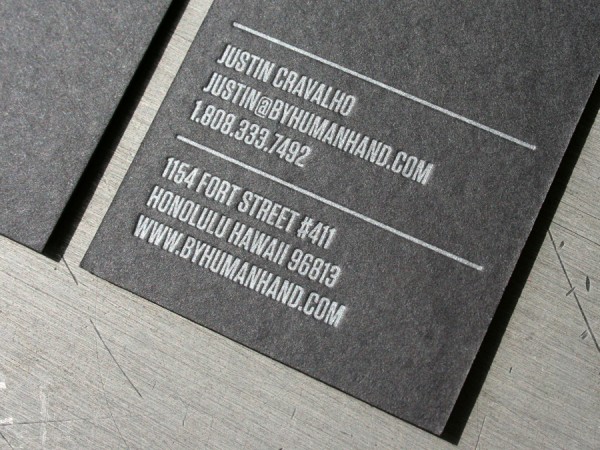
Straight from Hawaii, Human Hand sent us this fine business card design for letterpress printing. And we love the name. After all, human hands touching the tactile printing is what this letterpress card is all about. It is a subtle tonal varnish on one side and PMS 877 metallic silver ink on the other. The paper stock is our custom 200lb Wausau Eclipse Black cover weight.


Published on
September 20, 2010 in
Business Cards and Letterpress.
Tags: 200lb, 877, black, black on black, business card, Design, eclipse black, effect, hawaii, HI, human hand, ink, Letterpress, metallic, paper, pms, stencil, tactile, tonal, two sided, type, typography, varnish, wausau.
This stunning letterpress business card was designed by 485 inc. for an arts group called Artistaday. And as the name would imply, Artistaday is a website that has a daily fine artist featured. Great stuff too, make sure and check them out here.
The typographic design is nice and bold, making the blind (inkless) impression really stand out. These business cards do something that does take an extra production step - heavy impression on both sides that lines up from side to side. To get this blind type to look really look good and provide enough sculptural to keep it readable without ink, it needed to be printed as a single sheet, then pasted back to back after printing so the impression on one side wouldn’t flatten the impression on other. The cards were printed on 110lbC Crane Lettra, then glued together for the final 220lb thickness.


Published on
September 15, 2010 in
Business Cards and Letterpress.
Tags: 110lb, 220lb, 485Inc, artistaday, blind, business card, cards, crane, duplex, glued, heavy, inkless, lettra, paper, pasted, show through, thick, type, typographic.
Slate Studio in California does some really sharp interactive work. And their business cards are all kinds of Hollywood too. They pulled out all the stops on the card design and we worked with them through the production specs. The stock is our thick 200lb Cover Wausau Eclipse Black. We letterpress printed them with clear varnish on both sides, then a silver ink for the info text. Then they were foil stamped in a bright blue on each side. Finally, they were trimmed to size and edge colored in a matching bright blue.


Published on
September 8, 2010 in
Business Cards.
Tags: black, blocking, blue, bright, business card, eclipse, edge color, edge stain, edge tip, foil, heavy, hot stamp, ink, opaque, silver, slate studio, stock, thick, tipping, wausau.
These letterpress business cards were the perfect fit for web development and design company Ackmann & Dickenson. We like how these guys frame their business as “Craftsmen of Fine Technology”. They designed these cards and we letterpress printed them to reflect craftsmanship.
And this card did require some crafting. We started with the making of a custom duplex paper - 160lb Mohawk Loop Ivory Smooth pasted to French Construction Nightshift Blue 100C - totaling a thick 260lbC card. Next we letterpress printed them with two colors on each side, silver and tonal navy inks on the blue side, then blue and gray inks on the ivory side. We printed a couple 8up forms to meet all the employee name versions needs and then die cut them with small inverted corners. Viva tactility and technology.

Published on
September 2, 2010 in
Business Cards and Letterpress.
Tags: ackmann, blue, business, card, cards, corner, custom, dark, Design, dickenson, die, diecut, duplex, french, gray, heavy, inverted, ivory, Letterpress, mohawk, navy, nightshift, off white, pasted, pattern, quilted, round, soft white, stock, thick, tonal, two sided, web development.
These cards were designed by the Thorburn group here in Minneapolis. They are letterpress printed with a silver ink on both sides of a custom duplex black and white stock.
Custom pasting of a duplex of paper stock is a good way to make a project with look and feel unique. It’s very often the best way to get both the colors and stock thickness desired for a project. And lets face it - most of the stocks available from paper companies as pre-duplexed options are pretty fugly colors and/or texture combinations. This stock is Wausau Royal Complements Eclipse Black 100lb cover pasted to 100% cotton Neenah’s Crane Lettra Flo White 110lbC. For production, these two papers were pasted together, then letterpress printed.
As an end note, I worked at Thorburn several years before the jump to full time operations of Studio On Fire. Check out the Thorburn site here for some solid design work.

Published on
August 17, 2010 in
Business Cards.
Tags: 100lbC, 110lbC, 877, black, Business Cards, cards, crane, custom, duplex, eclipse black, flo white, florecent, glue, ink, Letterpress, lettra, metallic, neenah, paper, pasted, pms, royal complements, silver, thorburn, thorburn group, wausau, white.
These business cards were designed by fashion and luxury photographer Zachary Goulko. (be sure and check his portfolio for additional inspiration) His layout is simple with diagonal linear pattern and a flashy metallic copper edge color.
We letterpress printed them with 2 colors - a copper metallic ink and a tonal white ink. We used Wausau Royal Complements Bright White 100lb Cover paper stock. The card press sheets were printed then pasted together with an extra sheet in the middle to produced a triplexed sheet for an extra thick custom 300lb cover stock. They were trimmed and finished with the metallic edge color. These are lux with a definite presence.


Published on
August 13, 2010 in
Business Cards.
Tags: 100lb, 300lb, bright white, Business Cards, color, copper, diagonal, edge, fashion, ink, Letterpress, lines, metallic, pattern, photographer, tonal, triple, triplex, wausau, white, zachary goulko.
These over sized plaid pattern business cards were designed by our good friend Mark Saunders for his new solo creative venture PlaidLab. They use some great vibrant colors and the overprinting inks make rich and saturated secondary colors.
We letterpress printed them on heavy 220lb Cover Crane Lettra Pearl White. We usually run smaller custom business card orders two cards up on a small press sheet, so it was easy to provide some variety by including two different patterns. The magenta color is the same on both cards, but a color change from orange to blue on one plate gave the cards even more variety. One thing we did to keep the quality of the type crisp and punchy was to print it as a separate pass. By printing the same color in two passes we could run the large graphic plaid with heavy ink density and light ink density on the type. Mark was shooting for something about the size of an iphone, so the final cards were round corner die cut to an over sized 4.5 x 2.25. See comparison pic alongside a standard 3.5 x 2 inch business card for scale.


Published on
August 4, 2010 in
Business Cards and Letterpress.
Tags: 220lb, blue, bright, business card, colorful, crane, die cut, diecut, iphone, large, Letterpress, lettra, magenta, mark sauders, modern, orange, oversize, pearl white, plaidlab, round corners, rounded, scale.
