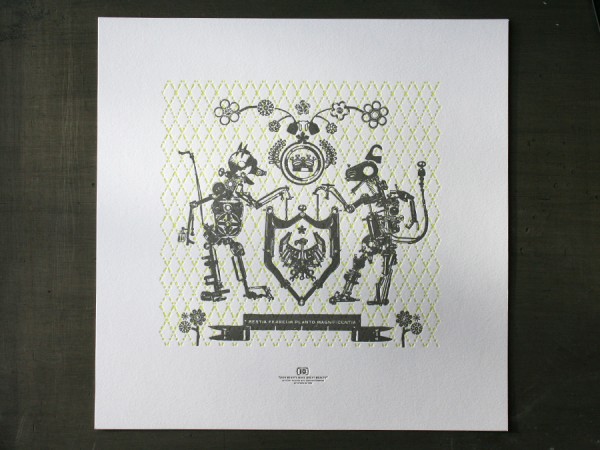
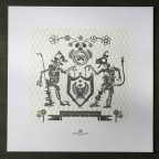
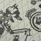
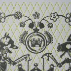
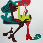
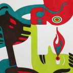
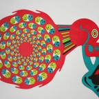
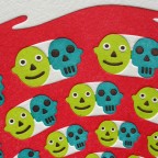
This is our letterpress poster for the Toys In The Attic show opening at the Soo Visual Arts Center on Dec 4th from 6 to 9PM. The show features both custom toys and toy inspired posters. Proceeds benefit Toys For Tots. Hey, that’s tomorrow night! We hope to see you there.
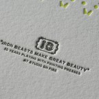
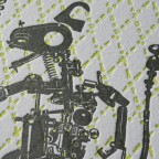
These beasts are in fact our toys. The graphic beasts are constructed from various press parts and form into a crest that commemorates ten years of printing here at Studio On Fire. The dog latin phrase reads “Iron Beasts Make Great Beauty”. It is printed in fluorescent and dark silver inks on Crane Lettra Flo White 220lbC at 13 x 13 size.
It was ten years ago this month back in 1999 that the first C&P was lowered into the then basement studio. More to come on our own ten year anniversary party soon.

Published on
December 3, 2009 in
Design, Letterpress, News and Posters.
Tags: 220lb, beast, crane, crest, Design, edition, fluorescent, ink, iron, Letterpress, lettra, minneapolis, poster, press parts, print, printer, silver, soo, soo visual arts center, soovac, studio on fire, ten years, toys for tots, toys in the attic, unique.
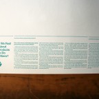
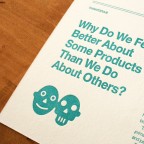
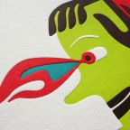
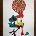
Thinktopia®, an idea generation company for some of today’s leading brands, commissioned this striking poster from illustrator Federico Jordan. Federico explains “The skull reflects our existence and interior vision: our vanitas.” He created this image for Thinktopia that explores the Shakespearian Yorick, San Jerónimo and mesoamerican skull racks called Tzompantli. There is an article on the back of the poster from Patrick Hanlon at Thinktopia that speaks about branding. (This poster print will serve Thinktopia as a new business tool - a mailing to prospective clients) More companies could learn from this - send out something cool to start a good conversation. We would say that an illustrated letterpress print is guaranteed way to get someones attention.
The 18 x 23 size poster is printed letterpress in four colors on Crane Lettra Pearl White cotton stock in both 110 and 220lb thicknesses on our Heidelberg Cylinder - quite possibly one of the most difficult jobs run in our shop recently. It was difficult because of the amount large areas of solid color, the thickness and size of the stock, and the tight registration. There is no overprinting of any of the colors, so all four color plates lock into each other with little forgiveness for shifts in register created by sheet distortion. Sheet distortion is physical stretching of the paper created under heavy impression. Each pass through the press creates slightly more distortion. So by the time we got to color number four, there was some colorful language as well. The 110lb stock ran pretty well but the 220lb stock is a bear to auto feed - especially five passes through the press.


Published on
November 6, 2009 in
Letterpress and Posters.
Tags: 110lb, 220lb, brand, branding, clients, cotton, crane, custom, cylinder, Design, edition, federico jordan, hanlon, Heidelberg, illustration, illustrator, Letterpress, lettra, mexico, minneapolis, patrick, pearl white, poster, print, printer, printing, Saint Jerome, Shakespeare, sheet distortion, skull, thinktopia, Tzompantli, unique, yorick.
Not that a heart felt email blast or animated web message for the holidays isn’t all well and good, but as you may have guessed we are suckers for a good old fashioned ink on paper. The next few days, we’ll show some previous custom holiday projects we’ve letterpress printed in the hopes of inspiring your own letterpress holiday projects. The holiday card seems to be one of those notorious last minute tasks for creative types. We are already heavily into estimating custom cards for many designers. And as much as we love rushing last minute projects, earlier is always better and leaves many more production options available. Word to the wise, ask us early for an estimate on your project.
…………
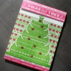
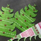
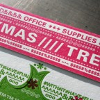
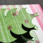
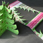
Who says typographic characters don’t make delightful tree ornaments? This card was designed by Katie and Nate over at Eight Hour Day. The green combined with hot pink makes a unique holiday color combo. The card was die cut to produce two parts for a desktop Christmas tree, to be decorated further with objects on your desktop. It was letterpress printed on thick Fox River Blotter stock from Neenah Paper. Since the paper is produced without any surface sizing the blotter sheet has a more mottled appearance in how the textured surface accepts a large solid ink area like the green tree. This gives the printed piece some additional tactile quality. Fa la la la la, ooolala.

Published on
October 28, 2009 in
Holiday and Letterpress.
Tags: blotter, card, cards, christmas, custom, Design, die, die cut, eight hour day, flourescent pink, fox river, green, greeting, heavy, Holiday, Letterpress, neenah, paper, pink, printing, score, tactile, thick, tree, type, typography, unique.
This simple one color wedding invitation was designed by the groom for the couples December wedding in Kyoto, Japan. The head silhouettes have a unique anime / manga style. We also love the modern graphic crest containing the interlocking rings and the matrimony announcement. It’s a bold yet refined design - traditional subject with a modern presentation. Nice work Osamu!
The cards were layed out together on a large 13 x 18 Flo White Crane Lettra 110lbC press sheet. These were printed on our Vandercook Uni III. We letterpress printed two passes of the gold ink for better ink density . Here’s something to keep in mind when running a double pass on a cylinder press - don’t adjust the packing on the press between pass one and two. By adjusting the packing, you also change the circumference of the cylinder, making it very difficult to register the second pass. We like to run two passes of ink metallics to give a little better sheen. Metallic ink, especially on an uncoated cotton stock will never be shiny like a coated stock or approach the mirror finish of a foil stamp, but it is crisp in details and does offer a small amount of shine.


Published on
October 6, 2009 in
Letterpress and Wedding.
Tags: 1 color, 110lbC, anime, cards, crane, crest, custom, cylinder press, Design, graphic, invitation, invitations, invite, japan, japanese, kyoto, Letterpress, lettra, manga, modern, one color, silhouette, stationery, uni iii, unique, vandercook, Wedding.
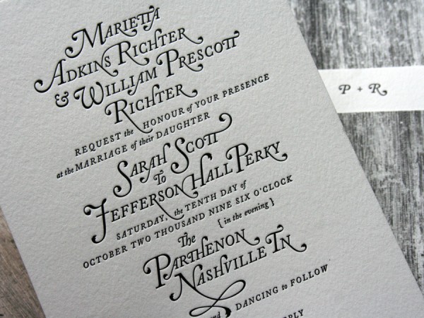
Designing your own wedding invitations has to be a designers most challenging project ever. And these are some to be proud of. The groom, Jefferson Perky of Perky Bros., designed these with an elegant typographic flair. They combine textural wood grain photography and letterpress printed type.
We produced these cards together on a 13 x 18 press sheet. The wedding invite was printed along with a save the date card, a thank you card, an accommodations card and a die cut vertical belly band. The stock was 100% cotton 110lbC Pearl White Crane Lettra. The wood grain was digitally printed, then the black type was letterpress printed.
When thinking about doing a letterpress wedding invitation it is important to consider all the cards you need upfront. We ultimately print everything together - saving us time and our clients cost. (Example - if you know you need a thank you card, plan to print it with the main invitation set.)


Published on
September 22, 2009 in
Letterpress and Wedding.
Tags: 110lb, band, belly band, cotton, crane, custom, Design, die, die cut, digital, groom designed, invitation, Letterpress, lettra, nashville, perky, perky bros, photograph, press sheet, printing, save the date, tennesee, thank you, TN, type, typography, unique, Wedding, wedding invitation, wood grain.
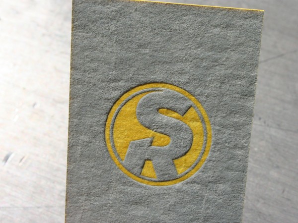
Caryn Gutterman designed this business card for photographer Scott Regan. We are suckers for letterpress printing the unique, custom and out of the ordinary. And these business cards are no ordinary cards. If Scott Regan hands you a business card, you will KNOW he’s handed you a business card. The thick stock is 60pt blotter stock. It is a little more textured on one side than the other. The texture of this stock is deep - reminds us of the finish on an egg carton, kind of raw and porous in appearance. It takes some work to print a solid letterpress, even more work on this stock. It’s not a fine surface like cotton sheets, but it’s soft and takes a nice impression which makes it attractive for letterpress. The paper just drinks up the ink and leaves paper fuzz everywhere - guess that’s why it’s a blotter stock. But the result is really beautiful. There is an uneven nature to the way the ink lays on the heavy formation of the paper. We printed the gray ink first, then the tightly registered yellow logo. The card was trimmed and edge colored in a PMS matching yellow. We like the simple modern design combined with the raw material - people will hang onto this card for sure.


Published on
September 9, 2009 in
Business Cards and Letterpress.
Tags: 60pt, blotter, board, business, card, cards, caryn gutterman, color, custom, Design, edge, egg carton, formation, heavy, Letterpress, modern, painting, paper stock, scott regan, solid ink, textured, thick, tipping, unique.
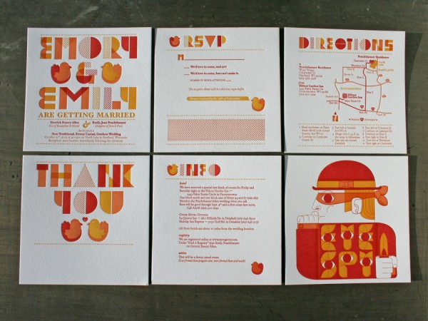
Not every wedding invite is so typographically unique as this one, with wedding birds too! Emily and Emory, the Bride and Groom designed these fun loving cards with display typography built from basic geometric forms overprinting each other. The warm color palette is three spot PMS colors which overlap and create additional letterpress texture. The cards are Crane Lettra Florecent White 110lbC 5 x 5 size - all printed together on a single large press sheet in tight register. They even included a little “eye spy” art print that turned out really sweet as well. The envelope is a metallic Stardream stock printed with silver metallic ink. Check out Emory’s site for even more illustrative work.


Published on
September 4, 2009 in
Letterpress and Wedding.
Tags: 110lb, crane, Design, emory, geometric, illustration, invasion, invitation, invite, invites, Letterpress, lettra, ocular, ocular invasion, orange, red, stationary, stationery, type, typography, unique, Wedding, yellow.
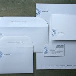
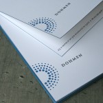
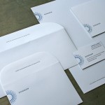
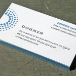
When a design firm gets all the details right, it’s a beautiful thing to print. These business papers for Dohmen were designed by GS design in Milwaukee, and the details are tight. We just finished printing them and thought it was a design well suited for letterpress. The radial dots under heavy impression create a tactile logo, the custom converted rounded envelope flaps echo the logo shape and the edge coloring is a perfect accent on the business cards and folding note card.
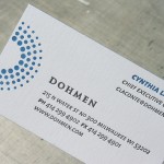
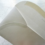
The business cards are Neenah Classic Crest Solar White 165lb Cover. They are 2 color letterpress printed with edges colored to match the logo PMS color. Since this was a single sided business card, some impression show through on the back side was not a concern. However, check out the photo of the back side of the business card and you get a visual on what we’d be looking at if there were printing. Printing on both sides with letterpress is possible. Be aware if if deep impression is used, there will be show through from side to side, even on thick stock like 165lb Cover. We can pull back on impression and minimize show through for two sided cards.
The note cards are Neenah Classic Crest Solar White 130lb C - just a little thinner to help get a nice fold.
The letterhead and envelopes are Neenah Classic Crest Solar White 80lb Text. We like the additional weight of an 80lb vs. a 70lb text weight for letterpress printing. It helps everything feel a bit more substantial and does better job with a heavy impression. And the custom converted envelopes are pretty cool - check out the side flaps - they even follow shape of the rounded seal flap. We freak out about stuff like that - nice.


Published on
August 24, 2009 in
Letterpress.
Tags: 130lb, 165lb, 80lb, business, Business Cards, card, cards, converted, cover, custom, deep, Design, detail, Dohmen, dots, edge color, envelope, envelopes, flaps, GS Design, impression, letterhead, Letterpress, Milwaukee, note card, notecard, paint, printer, printing, radial, show through, stationery, text, unique, wisconsin.
We worked with Vermont couple Dana and Katie to design and letterpress print their wedding invitations. They had a custom silhouette using their own hands to make a heart shape produced by Le Papier Studios. We used this motif throughout the invitation stationery. The soft cotton paper and bright blue silhouettes are contrasted with a simple recycled brown bag envelope and typewriter style navy typography - just the right balance of a raw yet refined style. The invites are printed in a square format with 2 inks on Crane Lettra, 100% cotton stock. All the cards were letterpress printed together on a 13 x 13 press sheet for cost effective production.
Dana and Katie are excited to be on the cusp of history, celebrating just after Vermont legalizes gay marriage on September 1st. Congrats!


Published on
July 16, 2009 in
Design and Letterpress.
Tags: blue, bright, brown bag, cotton, crane, Design, flo wh, hands, heart, invitation, invite, le papier studio, Letterpress, lettra, print, printer, printing, raw, recycled, refined, shape, shaped, silhouette, stationary, stationery, type, typewriter, typography, unique, vermont, Wedding, wedding invitation, wedding invite.
Fuel is a great creative shop in Iowa that sent us this unique business card design for Whatsup Juggling. It is letterpress printed on thick 220lb Crane Lettra cotton paper. The inks are orange, blue and a custom contaminated opaque white. The card was then die cut into 2.5 inch circles. We then tried to juggle them. Business cards are really hard to juggle.
Some production notes: The original intent was to have the white printing be a blind (inkless) impression. However, where those blind areas of text line up to one another from one side of the card to the other, there is a push back on the impression. When there is no ink to even out the visual appearance, legibility can suffer where the impression overlaps from side one to side two. Putting a white ink down contaminated with a bit of silver ink helps even out the look and gives the general appearance of a blind hit. Check out the pics for comparison. Still subtle, but with a hair more contrast than a true blind impression.


Published on
June 24, 2009 in
Letterpress.
Tags: 220lb, blind, blue, business, cards, circle, contaminated, cotton, crane, Design, die cut, diecut, double, double sided, Fuel, fuel inc, impression, ink, inkless, iowa, juggling, Letterpress, letterpress business cards, lettra, orange, round, thick, two sided, unique, whatsup, white.
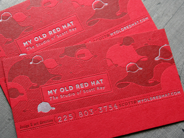
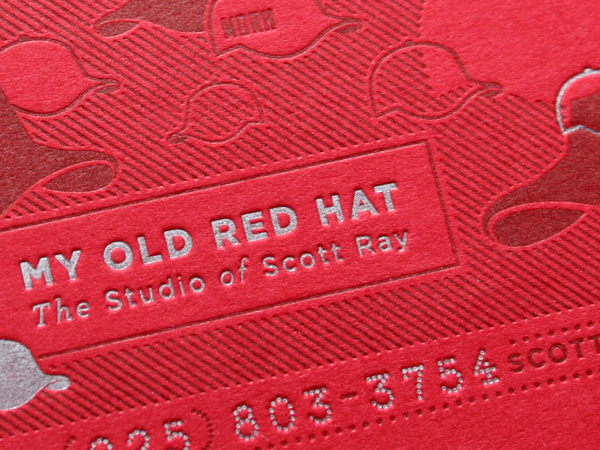
Scott Ray uses his favorite lid as his design monicker. He designed these cards using a colored paper stock and two inks. This card represents a couple really good ways to use ink on colored paper stock.
Using a colored paper is a great way to get a solid splash of color in a letterpress project without laying down a bunch of ink. But moving to darker colored papers presents challenges in printing. “Opaque” white ink really isn’t a great option since it really isn’t very opaque. With the exception of metallic inks, letterpress inks are transparent. So we used a metallic silver to print the lighter colored text. The tone-on-tone effect of printing a dark red ink on red stock is another great way to use ink on colored paper. The stock is 100lbC French Poptone which was custom duplexed to a double thick 200lb cover weight for a sturdy “thump factor”.


Published on
June 23, 2009 in
Letterpress.
Tags: 200lb, business, cards, colored, Design, duplexed, effect, french, hat, ink, Letterpress, letterpress business cards, metallic, my old red hat, opaque, paper, poptone, printing, red, scott ray, stock, transparent, unique.
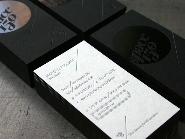
Space 150 changes their identity every 150 days. And with an identity process and look all their own, today marks the 23rd version of the Space 150 brand. This is a business card project we’ve managed the letterpress print production on for several versions now. Designed by Ned Wright at Space 150, this simple looking card still combines 4 production processes. Can you spot all four? Here they are:
250gsm Black Stonehenge sheet - FOIL STAMPED with gloss black foil.
22 pt White blotter sheet - LETTERPRESS PRINTED with silver ink.
After printing, these sheets are DUPLEX pasted back to back for zero impression show through.
After trimming the cards to size, they are EDGE COLORED in black for a clean look on the edge.
We print these cards for around 70 people. For a large studio, value comes with quantity. It would be fiscally improbable for an individual to produce a design like this on a small run of cards. (If you have to ask, “How much?”… )

Published on
June 5, 2009 in
Completely Unrelated and Letterpress.
Tags: black, blotter, business, Business Cards, cards, Design, duplex, edge color, edge coloring, edge painting, foil, foil stamped, impression, ink, Letterpress, minneapolis, ned wright, printing, silver, space150, stonehenge, typography, unique.
