Tag Archive for 'Business Cards'
Page 2 of 5
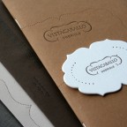
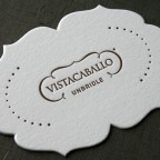
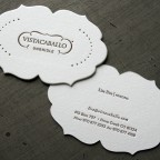
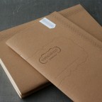
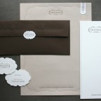
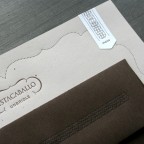
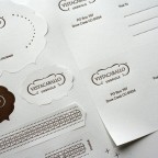
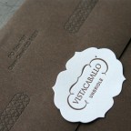
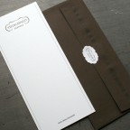
Vista Caballo is a ranch retreat with a special connection to horses in Dove Creek, Colorado. We worked with Thinktopia to design this stationery system for the client. They already had a logo design and needed stationery developed using the existing mark.
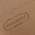
One of the things often overlooked in design is the choice of materials. This is something we strive for in our own design work. Material selection can be a central component for building the look and feel of a brand. In this stationery system we use a variety of brown toned papers to compliment the tactility of the letterpress printing and echo the desert landscape of the location. Kind of like making a color palette, instead we made a material palette. Each piece is printed with the same brown PMS color.
Letterhead is French Paper Speckletone Kraft, Envelope is French Paper Speckletone Chocolate, Business cards and Note cards are Crane Lettra Pearl White 220lb, Labels are Strathmore Soft White crack and peel stock, Journal covers are Fibermark Suedetex Tan 25pt with Smart Genesis Husk 70lbT gutt.
Richness of materials makes this stationery unique.
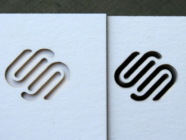
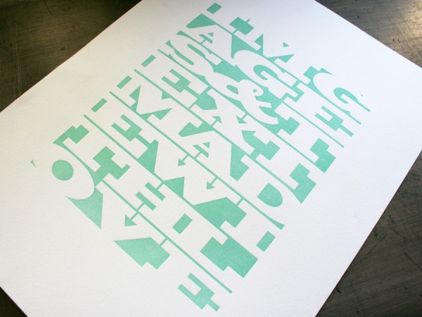
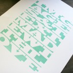
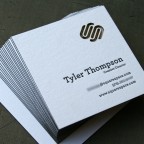
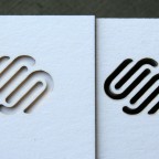
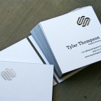
The simplest looking things can be deceptively complex. This is a tricky little business card and a typographic poster for Squarespace New York. Designed by their Creative Director Tyler Thompson. The design shows restraint, making the logo treatment the hero. And the format is a square card of course.
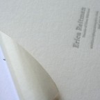
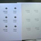
So why is the business card tricky? It is custom duplexed stock, letterpress printed, laser die cut and edge colored. We custom duplexed Neenah Classic Crest Solar White 110lb Cover up to a 220lb thickness. Then we letterpress printed them several up on a press sheet. A larger press sheet means we can economize the laser cutting by doing more at a time. The laser cutting can leave some scorch marks, so the sheet is masked with a paper tape that peels off after the cutting is complete. Then the sheet is trimmed up into cards and edge colored in black. That 220lb thickness shows off the edge and has a nice smooth surface. The poster is on Crane Lettra 110lb Flo white, pressed in a single PMS blue. 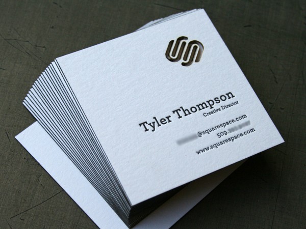
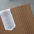
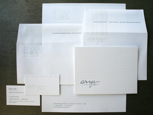
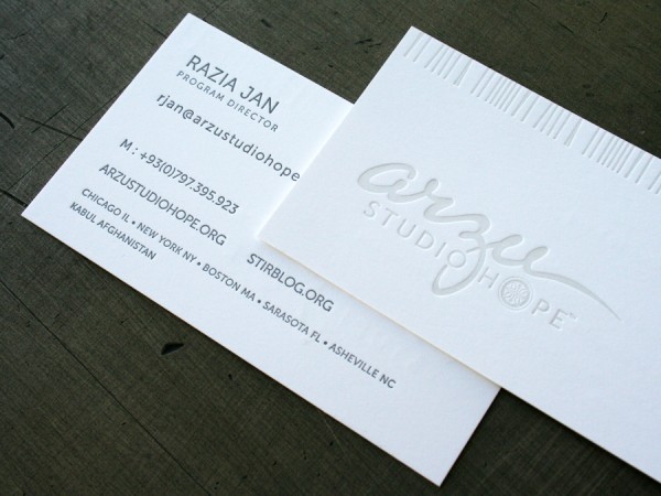
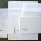
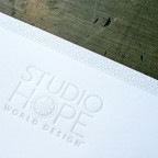
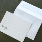
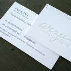
With beautiful pattern and subtlety, Jeff at Telemetry Studio designed this identity and stationery system for Arzu Studio Hope. Started by a former Goldman Sachs partner, Arzu is a social entrepreneurship company that works at a grassroots level to better the lives of women in Afghanistan.
We letterpress printed multiple elements for this stationery system using gray ink and contaminated opaque white ink on Neenah Classic Crest papers. The business cards are 165lb Solar White, a smooth stock with a with enough thickness for some impression on both sides with minimal show through. We printed on pre-converted envelopes opening the flaps, printing envelope face and flap at the same time, allowing the pattern to wrap from front to back. The pressed pattern in this system is elegant and understated, creating real tactile inspiration.
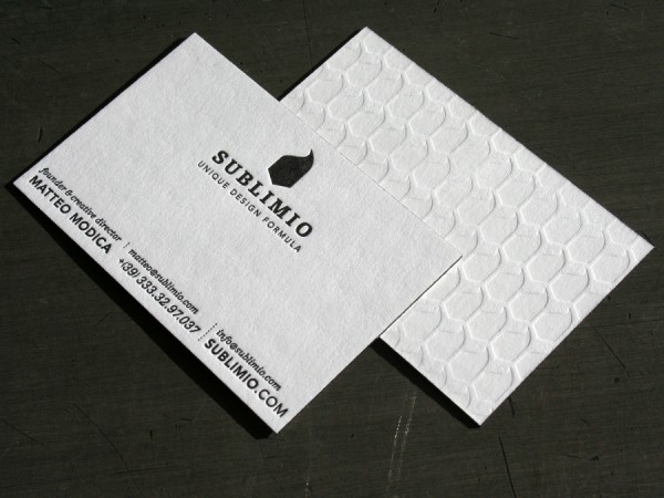
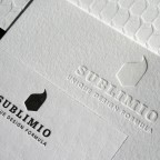
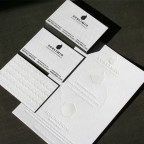
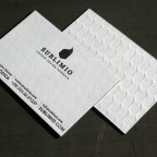
Sublimio is a multidisciplinary design studio in Italy. They designed these cards for an engaging visual and tactile design experience.
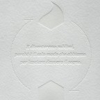
We printed a larger message card and business cards. The message card is very subtle with a blind impression only on 110lb Crane Lettra stock. The business cards use blind impression on one side and black on the other, completed with black edge coloring. They are on 220lb Crane Lettra.
“Show Through” is a term we use to describe heavy impression from printing one side of the paper bruising the sheet and showing small distortions on the reverse side. Show through is an important consideration when a design will be letterpress printed. The double thick 220 lb Lettra is great for a project that is a two sided design because it offers virtually no show through. Note that “virtually” is a key word here. If a heavy impression is desired, there will be some show through. Generally the thicker the paper, the more minimal the show through. But even with a thick stock, impression can knock back the impression from a previously printed side affecting its appearance. In the case of this business card we printed the flood of blind pattern first with heavier impression, then the black text side of the card with a bit less impression. Balancing this impression on a two sided design depends on the nature of artwork being printed. Talk with us early in the design process to work through these production decisions.
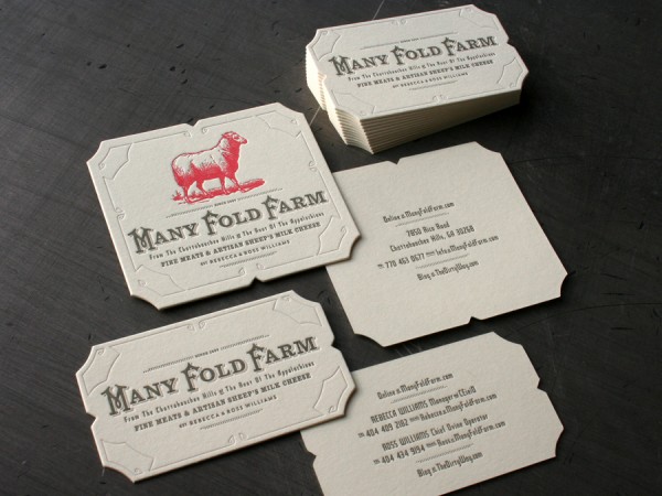
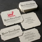
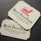
So often, what we do for our clients in the graphic design profession is disconnected from personal passions. This project managed to combine both food and design values. The food our family eats falls into a traditional foods diet, as recommended by the Weston Price Foundation. Which is why we were especially excited when Rebecca and Ross Williams asked us for business cards for their new adventure called Many Fold Farms. Their must-read blog is smartly written and shows a true passion for food and land. I’ve been learning about fine cheese and feeling a bit envious of their farming adventure.
This was both a design and print project for us, which is where our company can truly shine. Not that we don’t love printing the custom work of other designers and collaborating in the production process. We also love owning a design project from concept through production completion.
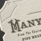
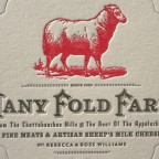
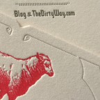
The design for the logotype merges custom 19th century inspired decorative capitals with slab serifs. We combined typographic texture with a folk inspired pierced tin borders and an inverted round corner die cut. The letterpress printing is on Crane Lettra Ecru (Ivory) 220lb Cover stock for a thick and soft feel in a nice warm color. We produced two different sizes - an oversized card with farm information and a smaller card with personal contact info.
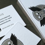
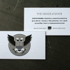
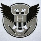
For some illustration inspiration and silk screen goodness check out the Heads of State from Philadelphia. They designed these business cards with an insignia that turns the national USA seal on its ear, adding an extra head and replacing the olive branch and arrows with a pencil and x-acto knife. We letterpress printed in black and dark silver on both sides of Crane Lettra 220lb FLo White and edge colored to match the silver - it’s a card thick enough to plant a listening device inside. And maybe we did that too… maybe.
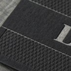
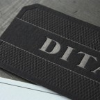
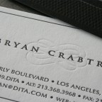
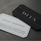
These are the brand new cards for Dita Eyewear in Los Angeles. Bryan Crabtree designed them and did a nice post over on his blog too. The blind flourish on the light side and the diamond pattern on the black gives these cards a tonal and elegant look.
We first printed these as two sheets, a natural color and black stock and then pasted the sheets together after printing. This step eliminates show through of the impression when printing a two sided design. We’ve found that the gluing of the sheet after it is printed does flatten back some of the impression, so we start with a heavy impression initially. The lighter color stock is Wausau Compliments Natural White 100lbC and is printed with a blind pass and black ink. The black stock is Wausau Eclipse Black 100lbC and is printed with PMS 8001 silver and black ink. The final thickness is 200lbC, about the thickness of a US dime. After printing and gluing, the cards were die cut to the final shape with angled corners.

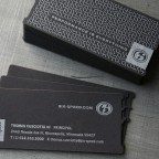
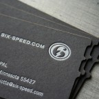
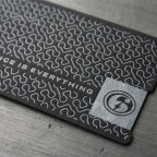
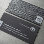
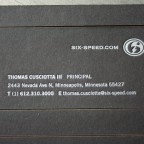
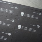
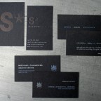
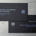
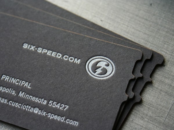
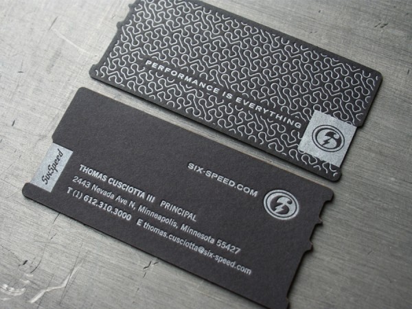
Six Speed sent us this design for custom letterpress business cards. They are a specialized events marketing company here in Minneapolis. And what could be a better business card job really - crushing AND burning all on the same press sheet.
The cards were letterpress printed on 200lb Eclipse Black Wausau with silver ink, then the press sheet was laser cut. The laser cutting was used due to the complexity of the cutting die and the size of the print run. Laser cutting does a really nice job, especially on darker stocks were the edge burn is less evident. With lighter colored and white stocks, a mask is sometimes sometimes required to prevent burning marks on the face of the sheet.
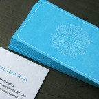
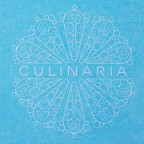
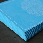
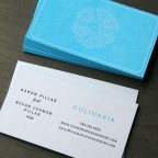
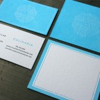
Jeff at Biklops Design created these note cards and business cards for catering and event planning company Culinaria. We love the simple line work logo and are a little amazed it actually printed. It is one of those “it turned out really cool but was a pain in ass to print” kind of projects. Inking a solid like this with letterpress is one of the more difficult things to print. There is a constant struggle to maintain minimal variation in the color density. With a large solid area the press sheet warps like a ripple potato chip, making feeding the sheets in register a challenge. And keeping the fine line weight of the logo from filling in made for a fun time on press. To help with the filling in on the logo we ended up shortening the exposure of the plate, which still hardens the plate but lessens the amount of base/neck material on the edges of the printed image. So good job on the design Jeff, we can even print your curve ball.
The cards are printed letterpress on 220lb Crane Lettra Flo White 100% cotton stock. The final trimmed cards were finished with a matching light blue edge coloring accent. The text is printed after the solid so it has a sculptural impression. If the text were printed first, the solid blue on the opposite side would flatten the impression down to near nothing.


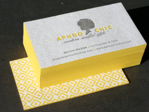
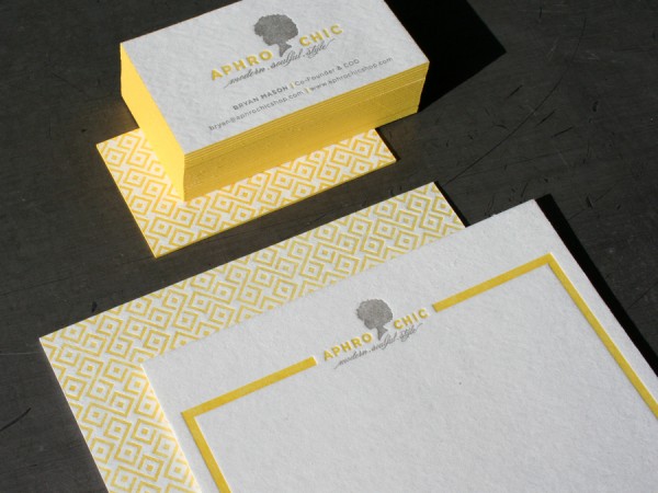
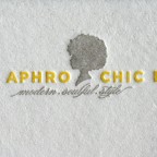
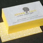
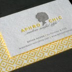
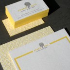
Abbie at Passing Notes is a master of refined print design. Her type is always exquisite and these cards for her client Aphro Chic were a pleasure to print. They are on a thick 60pt blotter stock with a flood of bold geometric pattern on the back and two color letterpress on the front. The blotter sheet has a pulpy appearance with lots of soft fiber texture. We printed the business cards along with a note card on the same press sheet so the print dollar went a bit further. The business cards were edge colored in a PMS match yellow for the perfect finishing accent.
