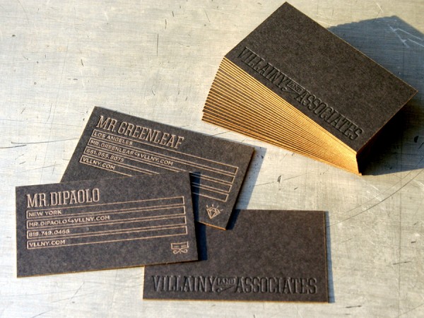
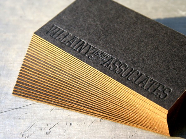
These cards designed by Villainy and Associates really make you stop and turn the thing over in your hand. The understated typographic design gives the letterpress production value emphasis. It’s simple and pseudo executive - flashy without being too flashy.
We printed letterpress metallic gold for the information and letterpress varnish on the logotype. We like using a varnish on dark stocks for a tone on tone effect. That gives a slightly better legibility than a totally blind, inkless impression. The stock is a thick 200lb Wausau Eclipse Black with metallic gold edge coloring.


Published on
October 12, 2010 in
Business Cards and Letterpress.
Tags: black business card, blind, crafted, eclipse black, edge coloring, edge staining, edge tipping, executive, gold edges, gold ink, heavy, impression, LA, Letterpress, los angeles, new york, NY, paper, thick, tonal, tone on tone, type, typographic, typography, varnish, villainy, villainy and associates, wausau.
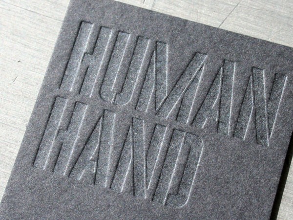
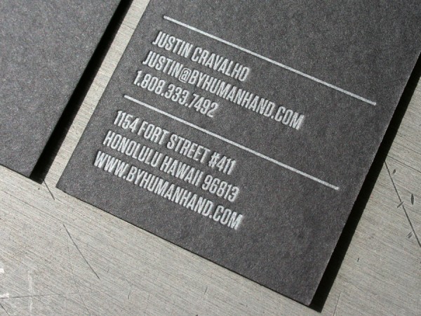
Straight from Hawaii, Human Hand sent us this fine business card design for letterpress printing. And we love the name. After all, human hands touching the tactile printing is what this letterpress card is all about. It is a subtle tonal varnish on one side and PMS 877 metallic silver ink on the other. The paper stock is our custom 200lb Wausau Eclipse Black cover weight.


Published on
September 20, 2010 in
Business Cards and Letterpress.
Tags: 200lb, 877, black, black on black, business card, Design, eclipse black, effect, hawaii, HI, human hand, ink, Letterpress, metallic, paper, pms, stencil, tactile, tonal, two sided, type, typography, varnish, wausau.
We love involved custom production projects with other design firms - especially identity systems. The refined work of designer Laurie DeMartino exemplifies the level of production we strive for in our letterpress shop. A keen eye for detailed type and color makes her design work striking. In fact, we believe she has a sixth sense related to finessing details. We worked with her to produce this identity system by matching her attention to detail on press.

Some noteworthy things about this system:
We partnered with another vendor to produce the offset floods of color on the letterhead and envelopes. Those big fields of color are next to impossible to hold consistent on letterpress. We can do larger areas of color (we did it on the note card and business card) but there is more variation in letterpress printing than in offset. When that variation is desirable we will print a flood of color on certain stocks. When it is not desirable, we recommend combining letterpress with offset. (Yes, that adds cost.) It is worth noting that we can print a large press sheet and often work in tandem with commercial offset printing.
Business Cards are 5 PMS /1 PMS. We matched the ink printed offset with our letterpress ink.
All the type and small graphics are letterpress printed. Light colored type is a heavy impression with custom mixed varnish. You can see in the letterhead detail and business card detail the show through on the reverse of the sheet.
The envelope is custom converted and has a perforation line across the flap.

Published on
February 25, 2009 in
Letterpress.
Tags: blind, Business Cards, commercial, custom, envelope, identity, impression, letterhead, Letterpress, letterpress services, minneapolis, notecard, offset, perforation, printing, stationary, stationery, system, varnish.
