Tag Archive for 'texture'

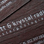
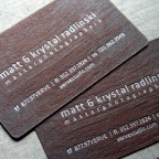
Verve Letterpress Woodgrain Business Cards

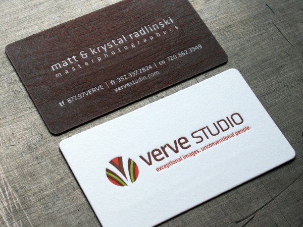
Designer of luxury stationery Leslie Vega created these business cards for the photographers of Verve Studio. Visit her blog post here for some additional images and details.

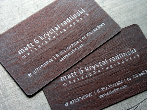
These letterpress business cards took us some time in production with six passes through the press. They feature a brown paper imprinted with a woodgrain texture in tonal varnish with the text in a metallic silver ink overprint. The offwhite side of the card is printed in three colors in tight, tight register. The stock is custom duplexed Crane Lettra Pearl White 110lb cover to Wausau Royal Complements Chocolate Truffle 100lb cover. The final card was round corner die cut to size.

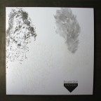
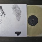
Taiga - Douglas Quin Letterpress LP

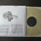
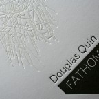
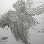
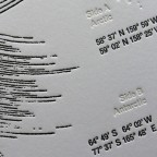
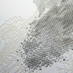
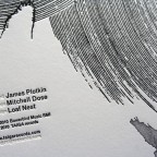
Fathom, the recent release LP from Taiga records, is a subtle and textural object of beauty and a sensory experience. The drawings were perfectly suited for letterpress and translated crisply to the printed edition. This is the description from Taiga:

“Douglas Quin’s Fathom brings together four extended underwater soundscapes—two each from the Arctic and Antarctic. The recordings have been gathered over a period of 15 years, capturing an extraordinary palette of sonic voices, events, spaces, and textures. To the human ear, these soundscapes are haunting and otherworldly; yet they are very much of this world—out of earreach. The tracks are minimally edited and are his first field recordings to be archived in vinyl. Included with the release is a sealed envelope containing an insert with specific locations, animals, and other elements heard, giving listeners the option to absorb sound with or without association. The envelope is printed with liner notes and comments from Dutch journalist and music critic René van Peer. Mastered by James Plotkin, cut direct to metal and pressed on 200 gram virgin-vinyl, Fathom comes packaged in custom letterpressed materials and is presented as a limited edition of 1000.”

There was clear, white, and black vinyl versions released. Only the black is still available.

The packaging is pressed in gray and a tonal white ink. We letterpress printed the outer sleeve on a custom duplexed stock - gray on the interior, white on the exterior. We were able to print on a preconverted inner envelope which accompanies the vinyl and containing the insert.

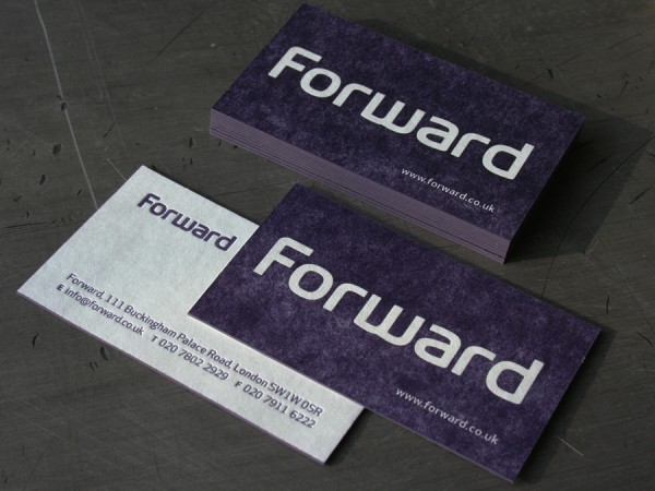
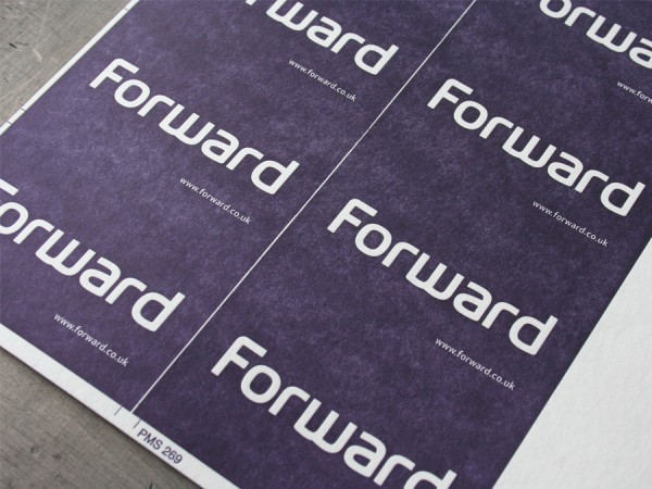
Forward Blotter Business Cards

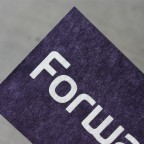
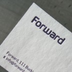
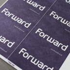
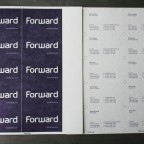
We made some new friends in London at a digital agency called Forward. They rebranded themselves recently and designed these cards that feel very undigital and textural, and that is what we do best. They are printed on Ahlstrom Blotter stock with custom duplexing to bring the thickness to about 50pt. This blotter board has an uneven pulp formation that gives the flood of ink a washed, almost denim feel on the soft paper stock. The cards are edge colored in a matching purple. And this was no small task, an office of over forty people is a lot of cards. We ran them 10 cards up on press five press forms.
Fabien Barral Business Cards & Note Cards

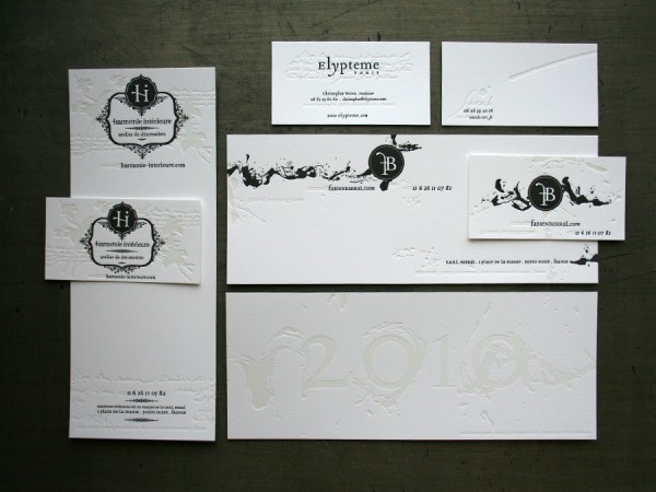
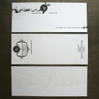
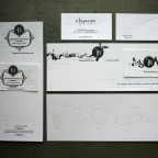
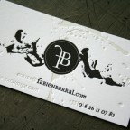
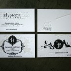
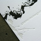
Here is another fantastic project designed by Fabien Barral over at Graphic Exchange. He brought in wonderful organic drips and brush strokes that interpret with a unique sculptural quality under letterpress impression.

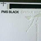
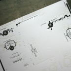
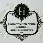
We put down a lot of letterpress printing on this sheet. It’s a good way to make a project affordable - - spread the cost over several items all on the same press sheet. The paper stock is Neenah Classic Crest Solar White 165lb Cover. The sheet contains four business cards and three large note cards. We printed a slightly contaminated opaque white ink for the tonal white effect, also a dense black ink. For our white ink, we usually put just a hair of silver in the opaque white to give it a little tone. It also has the benefit of creating a stronger sheen difference between the inked impression and the uncoated paper stock than you would get with a blind (inkless) print.

After printing this project went to live in French customs for a little while. And that should answer another question we get a lot - Yes! we do ship international all the time. Just let us know if you have any specific customs needs for your country.

Aphro Chic Blotter Business Cards

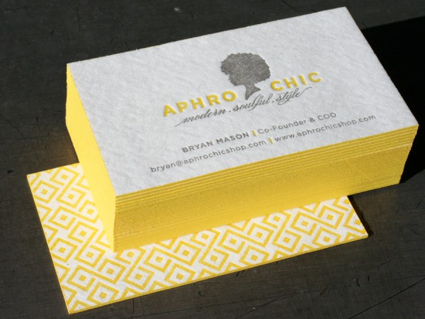
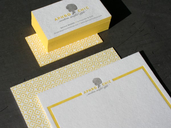
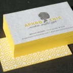
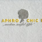
Abbie at Passing Notes is a master of refined print design. Her type is always exquisite and these cards for her client Aphro Chic were a pleasure to print. They are on a thick 60pt blotter stock with a flood of bold geometric pattern on the back and two color letterpress on the front. The blotter sheet has a pulpy appearance with lots of soft fiber texture. We printed the business cards along with a note card on the same press sheet so the print dollar went a bit further. The business cards were edge colored in a PMS match yellow for the perfect finishing accent.

_0001_aphro_chic_business_cards

_0003_aphro_chic_note_and_business_cards

English and Spanish Wedding Invitations

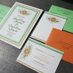
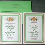
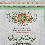
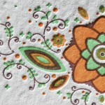
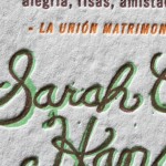
A bilingual wedding can be challenge. The bride needed invites in English and the groom needed Spanish. The simplest solution for this wedding in Mexico was both English and Spanish versions of the invitation. We designed and letterpress printed them with a textural yet refined style - a geometric border with a simple hand lettering for the couples names. The stock is Canalleto Grana Grossa 111lb Cover (20% cotton) and is printed in three match colors. The overprinting creates additional dimension and colors in the flower and vine motif. To integrate the invites closely with envelopes, we matched our ink colors to existing envelope colors from French Paper’s Poptone color line - orange fizz and limeade. Salud!

_0003_hanson_salgado_wedding_invitation

_0004_hanson_salgado_wedding

A Hamptons Wedding Invitation

_0003_averbuch_wedding_text21

_0000_averbuch_wedding_stationery1

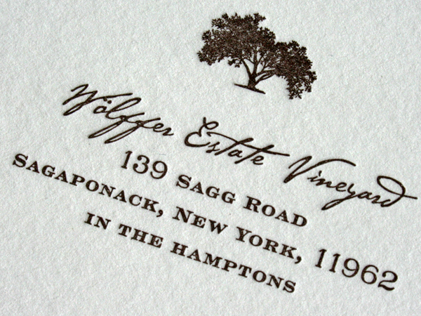
This invitation suite was designed by the bride, Stacey Averbuch. It is an elegant invitation in it’s typographic texture, mixing a coarse script font with a finely serifed engravers typeface. The ink is dark brown letterpress on Crane Lettra cotton paper. A cement green envelope color from French Paper was used for all the envelopes in the set. Email Stacey if you really like the design and would like her to work on a custom stationery set for you.

This a good wedding tip: Colored Envelopes. We like the simplicity of adding color to a wedding invitation set by using a colored envelope. It’s a great way to put some color in the set without the expense of letterpress printing more color.

The same dark brown color is printed on both the cards and the envelopes. We printed the invite cards together on a single press sheet and trimmed them to size after printing. That keeps the cost of all the cards more friendly. Also, don’t forget to include a thank you card while printing your inviations. That saves time and money in the long run. We specialize in printing custom sets brought to us by other designers and event planners. Thanks Stacey for a sharp looking invitation.