Archive for the 'packaging' Category

2011 Letterpress Calendar

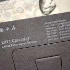
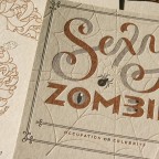
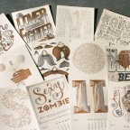
The Studio On Fire Letterpress Calendar is a favorite project in our shop for nearly ten years. It’s been worked on by many contributors from all over the world. Each year Studio On Fire puts together a loose theme, color palette and paper choices, then we invite 5 other designers / illustrators to participate. We design 2 months, and each contributor designs 2 months. Its always nice to have a large cross section of stylistic approaches within a little package that sits on your desktop. And this year is no exception. 2011 participants include Studio On Fire Adam Garcia, Brian Gunderson, Jessica Hische, We Make It So, and Aesthetic Apparatus.

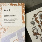
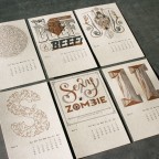
This years calendar is a departure from the usual graphic illustration in our previous versions. Our theme this year was “Letter Form Genus”, with many contributors incorporating type and lettering. We’ve not had a distinctly type related theme before, so this was extra fun. Some favorite details you’ll find are: a moustache wearing a monocle, a spider wearing a thong, a monkey skull on a snake skeleton, a hidden giraffe, and bacterial letter forms spelling “grow kindness.”

The calendar is printed all together on a large 26 x 20 size press sheet. It is trimmed down into 12 months on 3.25 x 5 inch cards. This year, the paper for the months and the outer wrap was a light brown Wausau Winter Wheat 100lb Cover. We design the tri fold outer wrap using bits and pieces of each months design, all mashed together and printed in a long strip.

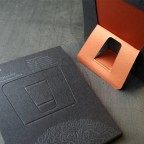
The stand was a custom duplexed paper made from dark grey Fibermark Eviva Stone 100lbC and copper Stardream 111lbC paper stocks. Our easel stand design has a clever fold-out angled leg that reveals the inner metallic paper color. The grey stock is letterpress printed in one color metallic silver.

These are now available on our studio site.

We’ve been doing this calendar for almost ten years now and have been fortunate to have some really great people involved. See a couple previous years here: 2010 Calendar, 2009 Calendar, 2008 Calendar.

Shine Advertising Knife Wrap Ephemera

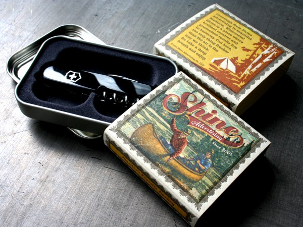
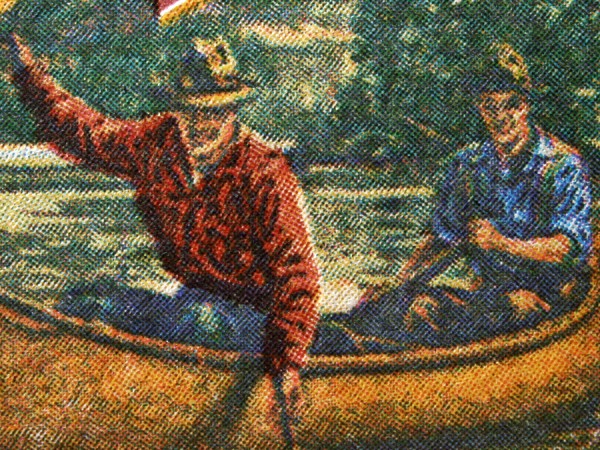
This ephemera was designed by the folks at Shine Advertising to dress up a pocket knife mailing sent to their clients as a promotional item. You might ask if that is really letterpress? Yep, actually that’s four color process plus two spot color letterpress printed one pass at a time. That means that lil’ piece of paper went through the presses seven times. (six color passes and a letterpress matrix score) Certainly not a typical use of letterpress, but that’s why it was so fun to print it. Laying down color one at a time means a little guess work as you build the color density for the final image, but fun to watch it unfold. The process printed picture was from CSA stock images and worked pretty well to break out into plates even though it started as a heavily line screened image. The plates were printed with a 90 line per inch screen on Mohawk Loop Husk 160lb Cover.

Also be sure and check out the flash light wrap we printed for Shine last year.
Taiga - Douglas Quin Letterpress LP

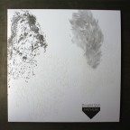
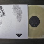
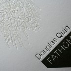
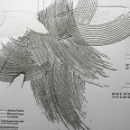
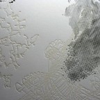
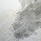
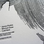
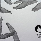
Fathom, the recent release LP from Taiga records, is a subtle and textural object of beauty and a sensory experience. The drawings were perfectly suited for letterpress and translated crisply to the printed edition. This is the description from Taiga:

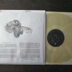
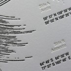
“Douglas Quin’s Fathom brings together four extended underwater soundscapes—two each from the Arctic and Antarctic. The recordings have been gathered over a period of 15 years, capturing an extraordinary palette of sonic voices, events, spaces, and textures. To the human ear, these soundscapes are haunting and otherworldly; yet they are very much of this world—out of earreach. The tracks are minimally edited and are his first field recordings to be archived in vinyl. Included with the release is a sealed envelope containing an insert with specific locations, animals, and other elements heard, giving listeners the option to absorb sound with or without association. The envelope is printed with liner notes and comments from Dutch journalist and music critic René van Peer. Mastered by James Plotkin, cut direct to metal and pressed on 200 gram virgin-vinyl, Fathom comes packaged in custom letterpressed materials and is presented as a limited edition of 1000.”
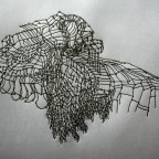
There was clear, white, and black vinyl versions released. Only the black is still available.
The packaging is pressed in gray and a tonal white ink. We letterpress printed the outer sleeve on a custom duplexed stock - gray on the interior, white on the exterior. We were able to print on a preconverted inner envelope which accompanies the vinyl and containing the insert.

BBDO - Letterpress CD Packaging, Coasters, Cards

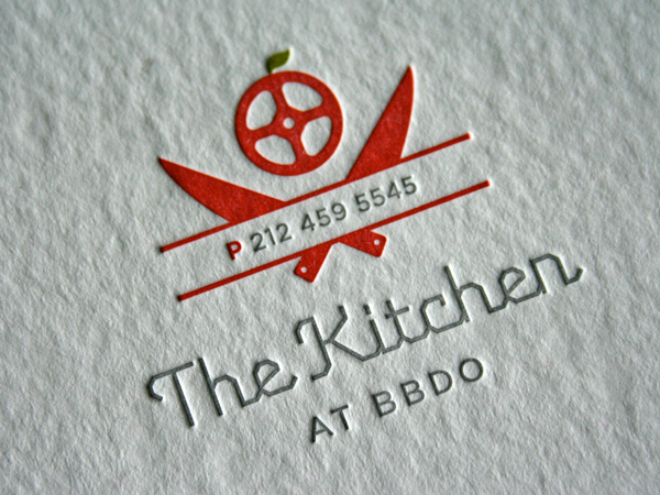
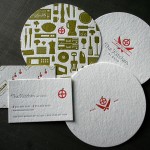
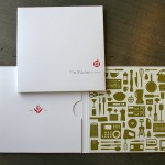
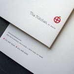
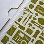
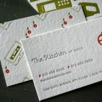
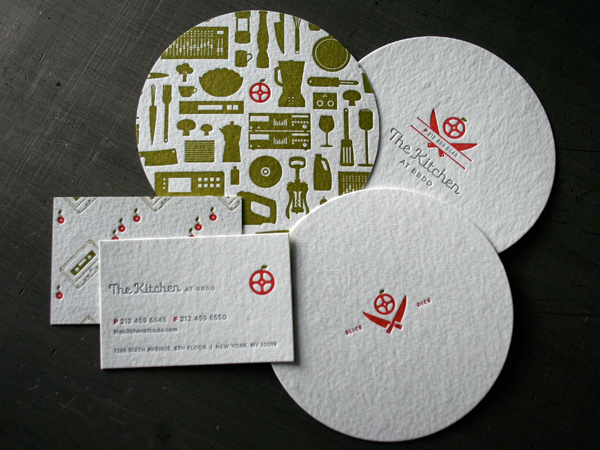
We print for other creative companies both large and small. Our friends in Designworks at BBDO in New York made up this gem of an identity system for their new post production suite called The Kitchen at BBDO. The system blends some fun patterns and crisp tiny type onto coasters, business cards and a CD package. And it was among the projects we printed that won a feature in the Print Design Annual.

It is a misconception that letterpress is only for small projects. We are not scared to run a big press sheet and handle large volume work. The 4 panel, 2 pocket CD package ran 2 up on our full size 18 x 23 sheet and was custom die cut and converted. The coasters and business cards ran together on a second sheet. And the details still look edible.

_0005_bbdo_kitchen_coasters_cards

_0002_bbdo_kitchen_logo

_0001_bbdo_kitchen_cd_package2