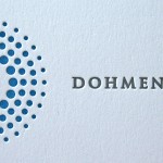
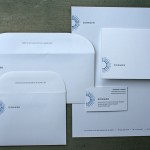
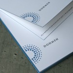
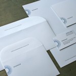
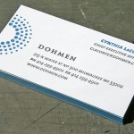
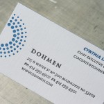
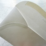
When a design firm gets all the details right, it’s a beautiful thing to print. These business papers for Dohmen were designed by GS design in Milwaukee, and the details are tight. We just finished printing them and thought it was a design well suited for letterpress. The radial dots under heavy impression create a tactile logo, the custom converted rounded envelope flaps echo the logo shape and the edge coloring is a perfect accent on the business cards and folding note card.
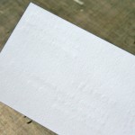
The business cards are Neenah Classic Crest Solar White 165lb Cover. They are 2 color letterpress printed with edges colored to match the logo PMS color. Since this was a single sided business card, some impression show through on the back side was not a concern. However, check out the photo of the back side of the business card and you get a visual on what we’d be looking at if there were printing. Printing on both sides with letterpress is possible. Be aware if if deep impression is used, there will be show through from side to side, even on thick stock like 165lb Cover. We can pull back on impression and minimize show through for two sided cards.
The note cards are Neenah Classic Crest Solar White 130lb C - just a little thinner to help get a nice fold.
The letterhead and envelopes are Neenah Classic Crest Solar White 80lb Text. We like the additional weight of an 80lb vs. a 70lb text weight for letterpress printing. It helps everything feel a bit more substantial and does better job with a heavy impression. And the custom converted envelopes are pretty cool - check out the side flaps - they even follow shape of the rounded seal flap. We freak out about stuff like that - nice.


Published on
August 24, 2009 in
Letterpress.
Tags: 130lb, 165lb, 80lb, business, business cards, card, cards, converted, cover, custom, deep, Design, detail, Dohmen, dots, edge color, envelope, envelopes, flaps, GS Design, impression, letterhead, Letterpress, Milwaukee, note card, notecard, paint, printer, printing, radial, show through, stationery, text, unique, wisconsin.
Erin Jang designed this custom wedding project for Marci and Ben with a unique combination of letterpress and digital printing. The typography here really has a beautiful touch - even with lots of different typefaces, the design is balanced and elegant. Not always an easy thing to do. We also like how the mini envelope on the invitation card creates another level suspense in opening the invitation.
We printed the letterpress portion of the project with 220lb Crane Lettra in an Ecru color and returned them to Erin for finishing. (They needed them quickly, and yes we are always doing some sort of rush custom letterpress work) These cards then had a unique small envelope afixed to them which contains the digitally printed red invitation. Also worth a produciton note is the perf that separates the map and the rsvp card into two parts. We used a fairly coarse perforating rule - about 20 tpi. (teeth per inch) A very thick stock needs enough paper left intact on the perf so it doesn’t just accidently fall off. It’s always worth having several kinds of perf rule around to test the stock and use the one that works best. The difference between a perf that just won’t tear clean and one that falls apart to easy can be tricky to balance. We keep rule around from around 18 tpi up to 100 tpi micro perf.
Check out Erin Jangs blog for more sweet design work. And if you want more, this invite has also been bloggity blogged on some of our favorite sites including Design Sponge, Black Eiffel and Mint Design Blog.


Published on
August 12, 2009 in
Letterpress and wedding.
Tags: 220lb, cotton, crane, custom, Design, designer, ecru, envelope, erin jang, gray, invitation, invitations, invite, Letterpress, lettra, mini, perf, perforation, printer, printing, red, script, stationary, stationery, tpi, type, typography, wedding.
When we posted the Save The Date card by designer Nick Brue a couple months back, we were super excited to see what he had in mind for the design of the actual wedding invitation. Finally, here is his design that just recently left the pressroom:


This invitation set is housed within a mini custom die cut pocket folder which neatly organizes the various cards. The folder is printed with a tonal custom woodgrain pattern using a clear varnish ink on letterpress with heavy impression. A belly band is fitted to the exterior of the folder with a Continue reading ‘Woodgrain & Crest Letterpress Wedding’
Published on
May 8, 2009 in
Letterpress and wedding.
Tags: band, belly band, brown, buckle, crest, custom, Design, die cut, diecut, folder, invitation, invite, Letterpress, letterpress printing, mini, minneapolis, minnesota, monogram, nick brue, pocket folder, printing, shield, stationery, tiny, tone on tone, type, typography, wedding, wedding invitation, woodgrain, wrap.


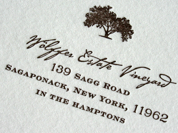
This invitation suite was designed by the bride, Stacey Averbuch. It is an elegant invitation in it’s typographic texture, mixing a coarse script font with a finely serifed engravers typeface. The ink is dark brown letterpress on Crane Lettra cotton paper. A cement green envelope color from French Paper was used for all the envelopes in the set. Email Stacey if you really like the design and would like her to work on a custom stationery set for you.
This a good wedding tip: Colored Envelopes. We like the simplicity of adding color to a wedding invitation set by using a colored envelope. It’s a great way to put some color in the set without the expense of letterpress printing more color.
The same dark brown color is printed on both the cards and the envelopes. We printed the invite cards together on a single press sheet and trimmed them to size after printing. That keeps the cost of all the cards more friendly. Also, don’t forget to include a thank you card while printing your inviations. That saves time and money in the long run. We specialize in printing custom sets brought to us by other designers and event planners. Thanks Stacey for a sharp looking invitation.
Published on
April 30, 2009 in
Letterpress and wedding.
Tags: brown, color, contrast, cotton, crane, custom, dark, engravers, envelope, estate, french paper, green, hamptons, invitation, invite, Letterpress, lettra, printing, script, serif, texture, tree, typography, vineyard, wedding.
We love involved custom production projects with other design firms - especially identity systems. The refined work of designer Laurie DeMartino exemplifies the level of production we strive for in our letterpress shop. A keen eye for detailed type and color makes her design work striking. In fact, we believe she has a sixth sense related to finessing details. We worked with her to produce this identity system by matching her attention to detail on press.

Some noteworthy things about this system:
We partnered with another vendor to produce the offset floods of color on the letterhead and envelopes. Those big fields of color are next to impossible to hold consistent on letterpress. We can do larger areas of color (we did it on the note card and business card) but there is more variation in letterpress printing than in offset. When that variation is desirable we will print a flood of color on certain stocks. When it is not desirable, we recommend combining letterpress with offset. (Yes, that adds cost.) It is worth noting that we can print a large press sheet and often work in tandem with commercial offset printing.
Business Cards are 5 PMS /1 PMS. We matched the ink printed offset with our letterpress ink.
All the type and small graphics are letterpress printed. Light colored type is a heavy impression with custom mixed varnish. You can see in the letterhead detail and business card detail the show through on the reverse of the sheet.
The envelope is custom converted and has a perforation line across the flap.

Published on
February 25, 2009 in
Letterpress.
Tags: blind, business cards, commercial, custom, envelope, identity, impression, letterhead, Letterpress, letterpress services, minneapolis, notecard, offset, perforation, printing, stationary, stationery, system, varnish.


