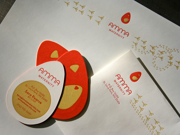
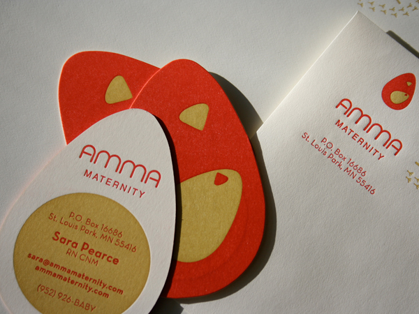
The design team at Imagehaus created a delightful system for Amma Maternity. We printed a simple two color letterpress system with an egg shape die cut for the cards. We ran the solid ink for the business cards on our Heidelberg cylinder press to achieve the pressure and the ink coverage required to print this area. First we printed the chicken, then the egg. Or was it the other way round?
Monthly Archive for February, 2009
Page 2 of 2
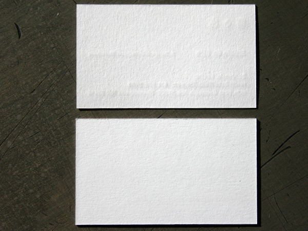
We love thick stocks. It is a friend with benefits. One of the challenges in letterpress printing is working with the “show through” of the impression to the opposite side of the page. When you have a thicker stock it becomes easier to show more impression and have less show through.
These pictures compare 110lb Cover (300gsm) with 220lb Cover (600 gsm) Crane Lettra which is 100% cotton. What you should notice is that they both have a sculptural impression. But the thinner stock on the top does have some show through, while the thicker stock below has even more impression and no showing on the opposite side. That becomes important if you are doing a two sided business card and wish to minimize showing. The depth of impression on letterpress is controled by varying the amount of packing material underneath the sheet being printed. A single sided design is easier to achieve heavy impression because there isn’t as much worry about the back of the paper.
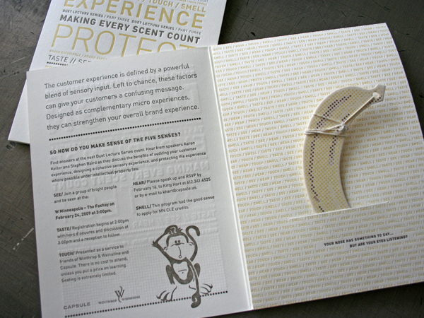
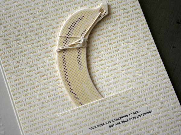
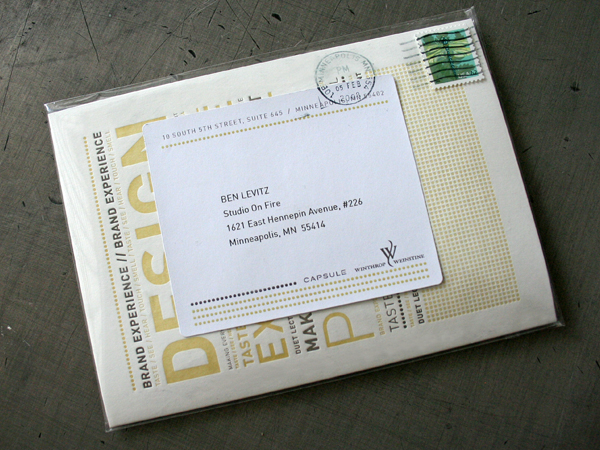
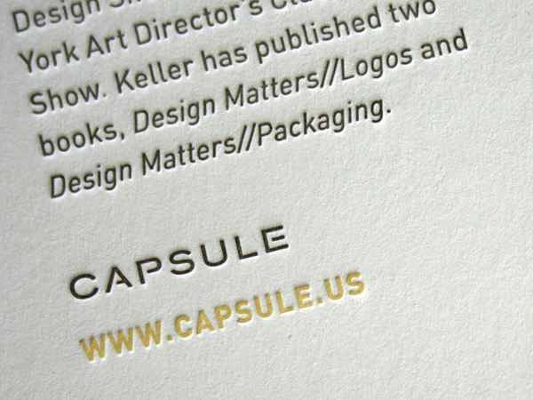
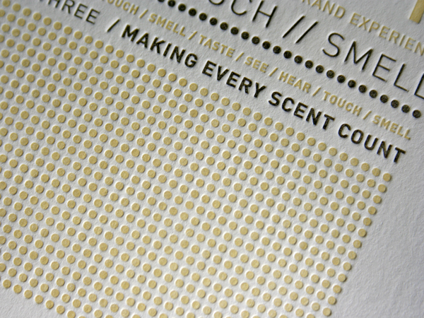
This lecture invite folder was designed by our friends at Capsule and letterpress printed in our studio. We were especially excited by the topic. The Duet Lecture this year from Capsule and Winthrop & Weinstine is about designing and owning a cohesive sensory experience. They did a great job with the concept by incorporating the visuals (sight) with letterpress (touch) and an air freshener (smell). The uncohesive twist is that banana actually smells like bubble gum. (No, we don’t do air fresheners. They produced and inserted that one.) One of the things letterpress prints extremely well is type. The type intensive design here made for an exquisite overall texture.
Utilizing the sensory aspects of design is something we particularly embrace in our own studio. The tactility of letterpress strengthens design in a way that sets it apart from other production methods. The sculptural impression is a signature of the process. Having material awareness and knowledge of production is critical to how we approach projects with our clients.
This project was printed 2/1 pms on a larger 13 x 18 press sheet, (We can print up to an 18 x24 sheet) then die cut and converted. We’d love to make letterpress part of your brand. If you need large format and longer runs of letterpress printing contact us for an estimate.
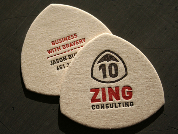
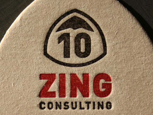
We designed this identity with mountaineering in mind. Saying “10 Zing Consulting - Helps you reach the top” would have been really lame. So we wrapped that message into the design with the shape. Show it, don’t say it.
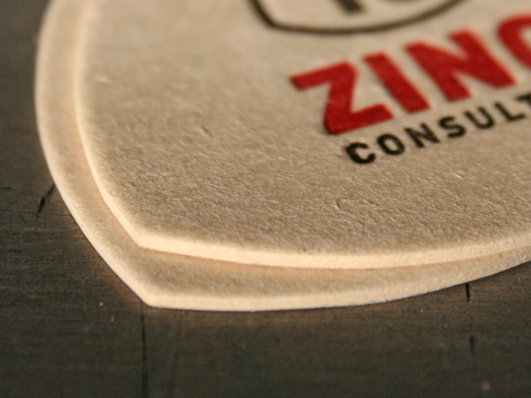
We went lo-fi with the production and used a 55pt coaster board with 2 color letterpress. Then the pieces were steel rule die cut. Coaster board works OK for letterpress printing, but isn’t the best if you are looking for a deep impression. The material core is soft and the surface will tend to crack if you drive the plate to deep. It also sucks up the ink and requires heavy ink lay down.
In addition to our design work, our letterpress room prints projects for designers and agencies all over the country. Contact us for an estimate on your project.
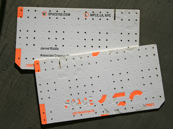
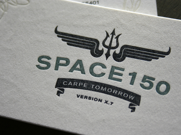
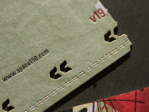
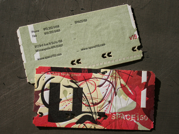
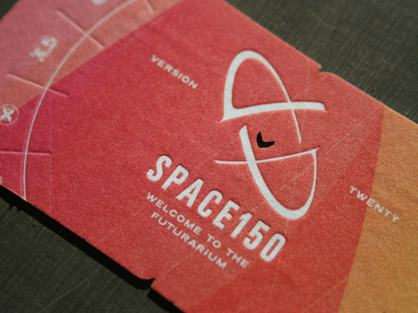
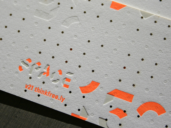
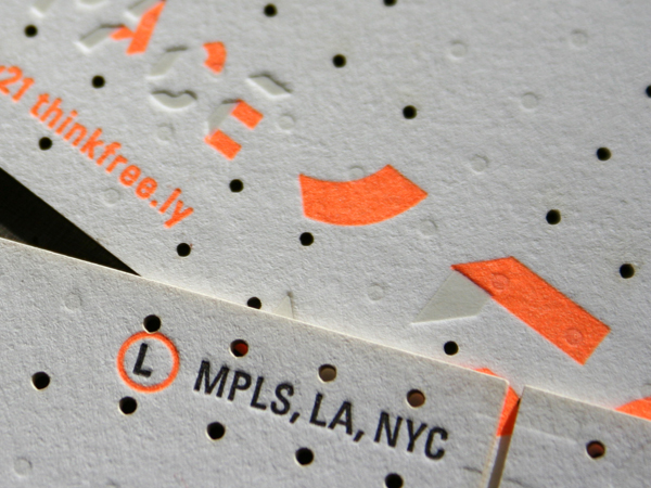
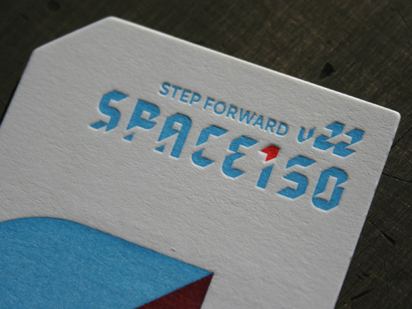
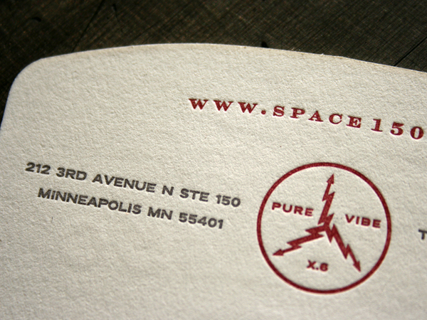
It started back in high school art class. I was a junior and there was this senior that sat in the back doing pottery and was always throwing frickin’ balls of clay at my head while I was trying to draw. Fast forward over a decade and both of us have design careers. Me - running my design/letterpress studio and he (Jason Strong, or Bone as some people call him) is a design director over at Space150. He called me up and invited me to be a guest designer on a Space150 identity system version.
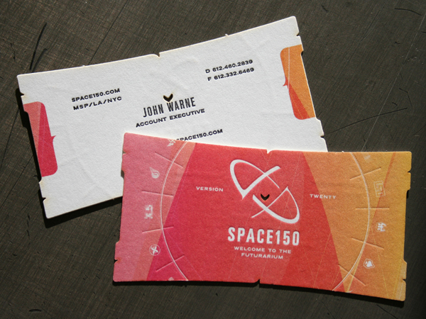
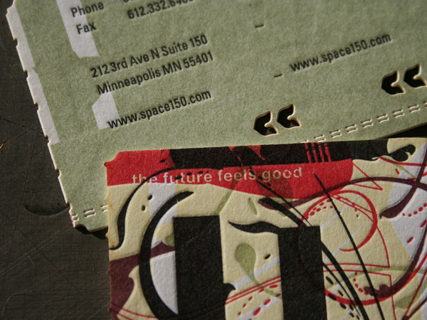
Now what you must understand about Space150 is that they redo their entire identity every 150 days. The WHOLE thing - business papers, website, mission statement, etc.
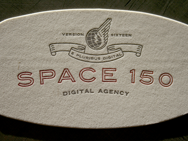
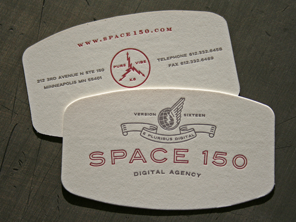
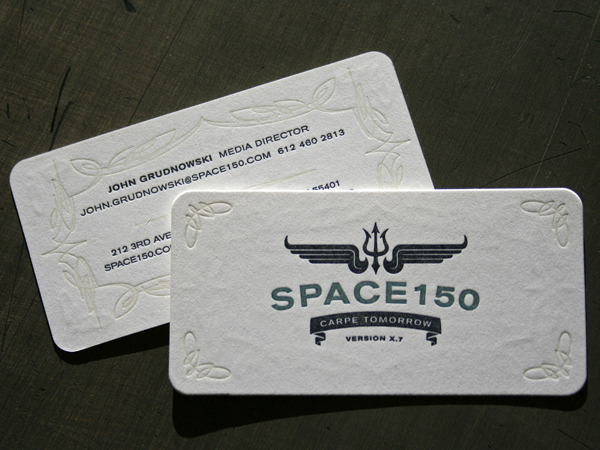
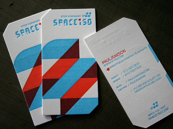
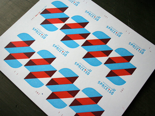
Our studio gladly accepted the assignment to design version 16 with letterpress printing for the full system. Version 16 was such a success that we were invited back to create and letterpress print version 17 as well. They moved off of letterpress for version 18 and almost had a mutiny because everyone became attached to their letterpress business cards. And believe me those new media folks really know how to throw down a mutiny. So version 19, 20, 21 and the current version 22 are all produced by Studio On Fire with letterpress printing, laser cutting, etc. Space 150 has designed 19-22 in house with their own killer designers, Ned Wright and Dan Jenstad.
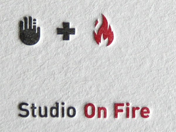
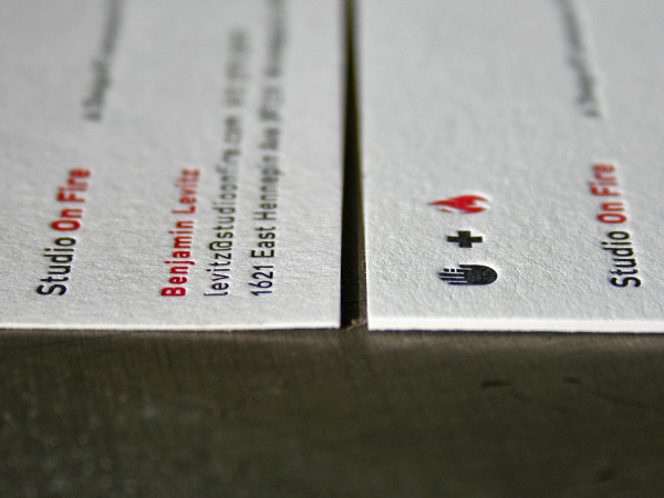
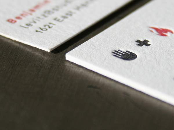
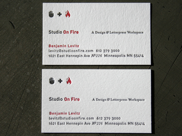
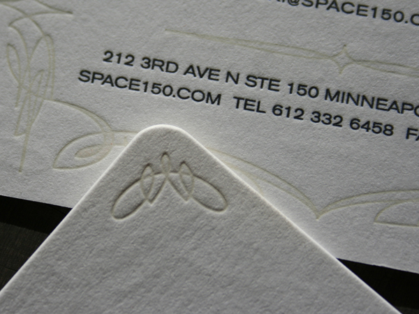
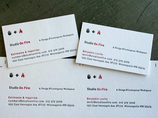
It is our hope that this set of business cards represents a very different sort of letterpress printing and approach to commercial production. Studio On Fire is not tied to the historical visual baggage of letterpress. We try to take a little vintage and a little modern and mix it together with mad production skills. In the end, these cards land in peoples hand with a sense of wonder - and that is what good design and production is all about. Enjoy…
Please contact us for your next challenging print project. We thrive on working with other creatives to produce award winning design.
Oh, and Jason, just you wait. I’ve got some clay balls saved up for next time we meet. Unless we can settle this like gentleman?
When our letterpress printing client at Electric Fusion handed out one of his new business cards, almost a year later he saw a project come in because someone remembered his card and held onto it. Here’s a note just in from our client:
“I hope all is well. I wanted to share a story about a new client and project I just landed. My client told me that part of the reason they remembered me (in addition to my sparkling personality) was the business card. So, thanks — I dig having a memorable card!”
At a time when virtually every industry is struggling, letterpress is bringing business in the door. The tactile quality of letterpress is about creating something memorable that literally buys a few extra seconds in the hands of a recipient. Appealing to both sight and touch senses helps create that memory. We thought it was sweet that someone doing web application programming wanted letterpress business cards. What could be more opposite than letterpress? But we know it works, and not just for creatives. As creative professionals, we all have our little bin labeled “cool business card samples” don’t we? It’s important to remember that the “cool business card” reaches beyond us as creatives and has some very practical business realities. So, why haven’t you contacted us to letterpress print your project yet?
Since we get a lot of requests from students, soon-to-be graduates and folks just wanting to give a sweet gift, we decided to run a special price on Business Cards so everyone can experience personalized, letterpress goodness. And, since we generally print Business Cards 2-up on a press sheet, we can run cards for 2 people as easily as for 1.
Continue reading ’2 Friends Special - Letterpress Business Cards’
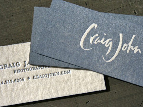
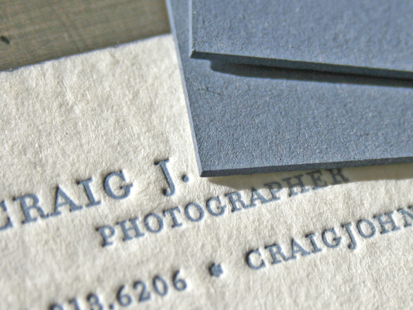
Wedding photographer Craig J.Stodola wanted a card with a memorable thump factor. This one is printed on 60pt blotter. And take a look at the edge coloring. After we printed a Pantone color, we color matched the edges to the face of the card.
