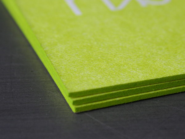
These cards were designed by Reddoor Creative in LA. Finely designed and printed business cards speak volumes about a business or an individual - and there are no half measures here. These cards are letterpress printed 2 pms colors each side plus a blind hit. The paper is custom duplexed Fluorescent White 268lb 100% cotton Crane Cover Kid Finish. We’d say they have a “thump factor”.
Duplex means pasting two sheets of paper back to back. In this case, we had the sheets pasted AFTER they were printed. We started with a press sheet for the front of the cards and another press sheet for the back of the cards, each sheet being at 134lb Cover weight. What this accomplishes is deep impression on both sides of the card with out show through from a heavy letterpress impression. Custom duplex pasting a sheet is the best way to achieve that heavy impression both sides and get a nice thick card with the artwork on both sides looking top notch. After pasting the press sheets together they were trimmed to size and edges were colored to match the printed pms. Coloring the edge of paper that thick really makes the most of the edge coloring effect.
I think I want to buy a house from this guy.


Published on
August 25, 2009 in
Letterpress.
Tags: 134lb, 268lb, back to back, both sides, business, California, cards, coloring, crane, deep, Design, duplex, duplexed, duplexing, edge, edge coloring, heavy, impression, LA, Letterpress, letterpress business cards, los angeles, luxury, painting, pasted, pasting, printer, printing, reddoor, reddoor creative, tipping, trimmed, typography.
We just love folks that can blur the line between the disciplines of design and illustration. Jessica Hische is certainly one of those rarities. Be sure and check out her site for more great hand lettering and typography. She designed these business cards for new project by Mischa and Jacob DeHart called Culinary Culture - A Site for Serious & Aspiring Foodies.
We letterpress printed these cards on 220lb Crane Lettra, 100% cotton stock. They are printed three colors on the logo side and two colors on the text side. Additionally, the logo side needed the dark red run as two passes - something we often do in letterpress when there is a solid area of color and text on the same plate. The heavy ink density needed to cover a solid versus the light ink density for text lets the type remain crisp and the solid run as saturated as possible. (That means this piece of paper ran through the press six times - four on front, two on back.)
And of course they just wouldn’t be complete without some edge coloring. These have a contrasting green edge which is nice and noticeable on the thick 220lb stock. We usually recommend edge coloring be applied to stock heavier than 160lbC. Coloring can be applied to thinner sheets, but the effect is more pronounced with thicker paper.
Published on
June 29, 2009 in
Letterpress.
Tags: 220lb, business, card, cards, cotton, crane, culinary culture, Design, edge, edge coloring, edges, handlettering, heavy, illustration, jessica hische, Letterpress, letterpress business cards, lettra, painting, printer, printing, serious foodies, thick, tipping, type, typography.
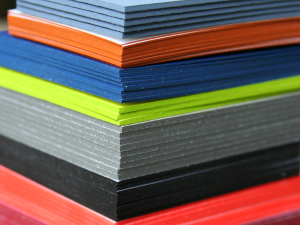
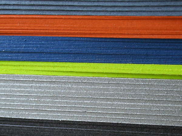
We turn some tricks in addition to letterpress and design. This little production trick may cause a full-on business card fondling session. We call it edge tipping, edge painting, edge coloring. We use the process to color the edges of cards, books, journals, notepads - anything with a thickness can be colored. Any Pantone color, including metallics, can be specified. For single cards we recommend stock of 160lb and up. We do this after printing and trimming the stock to size.
House of Monks is one of our favorite cards using this process. Her design takes the color printed on the face of the card and matches that same color on the edge. So simple and modern, we call that sweeeet.


Published on
February 13, 2009 in
Letterpress.
Tags: accent, books, business cards, coloring, edge, house of monks, journals, letterpress services, metallic, notepads, painting, pantone, pms, printing, tipping.


