This is a nifty little letterpress card and a7 envelope designed by Duel Purpose in Austin, Texas. It is printed in three colors, the overlapping bold graphics make unique areas of overprinting ink. The stock is 100% cotton 220lb Crane Lettra, with a matching Lettra envelope. Hand written correspondence on these are sure to any leave digital message in the lurch.

Published on
February 4, 2010 in
Letterpress.
Tags: 220lb, austin, black, blue, bold, card, cards, correspondence, crane, duel purpose, duelpurpose, graphic, ink, Letterpress, lettra, overprinting, printer, printing, red, stationary, stationery, texas, writing.
We just got these suckers back from Ideal Printers over in St. Paul- designed by SOF and offset printed (feasibility and cost issues made it much more reasonable for offset) for The College of Visual Arts- in St. Paul as well.
In order to make the colors on this guy pop as hard as possible we swapped out the standard CMY inks with their florescent equivalent. The actual design process was one of the funnest yet- we took various wood type and ran scrap paper through a little tabletop proofing press and immediately sprayed with our press wash-up solvent and then isopropyl alcohol to make interesting splatters / streaks / clouds / etc. The solvent and the alcohol has the same effect when mixed as gas and water.


Published on
July 24, 2009 in
Design and News.
Tags: 2009, College of Visual Arts, CVA, day-glo, Design, flourescent, halftone, Letterpress, offset, overprinting, poster, st paul, typography, Visual, Wood Type.
This invite pumps up the jam with an old school boom box and mix tapes. We love it for it’s fun factor and unique departure from most wedding stationery. The horizontal size is different, the illustration is super fun and the couples initials are even in the speakers of the boom box!


Adam Ramerth at Lark designed this set. He did a fantastic job with the theme. And we must say, this is a demanding letterpress printing job. The registration is TIGHT. The two yellow and blue colors align critically over one another to create the green as they overprint. The large graphics with small type make Continue reading ‘Mix Tape Letterpress Wedding Invitations’
Published on
April 5, 2009 in
Letterpress and Wedding.
Tags: adam ramerth, boombox, crane lettra, french paper, ghetto blaster, ink, invitations, invite, lark, Letterpress, mix tape, overprinting, printer, printing, stationary, stationery, tapes, two color, Wedding.
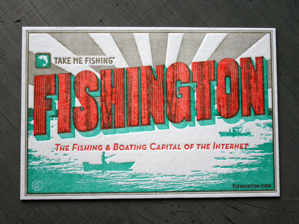
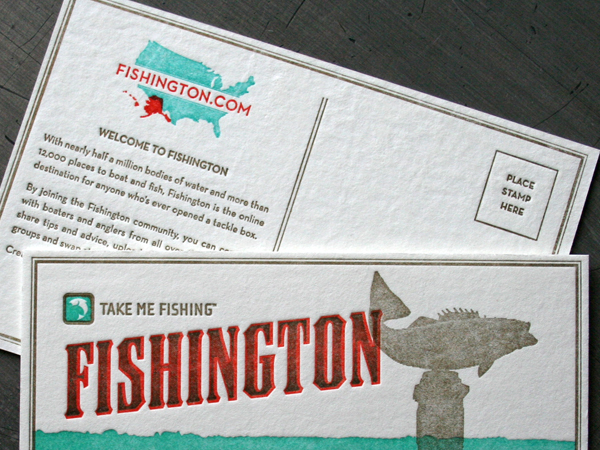
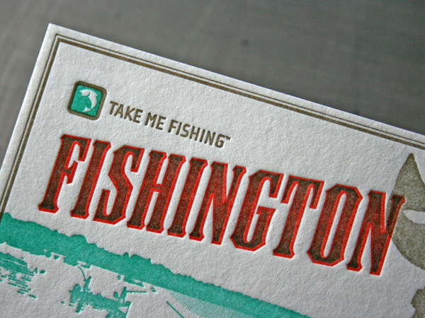
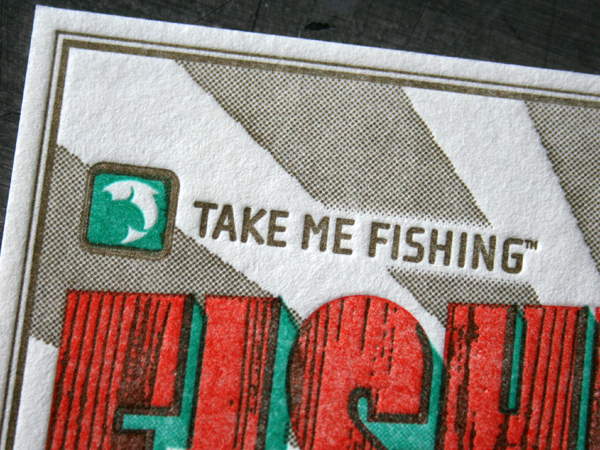
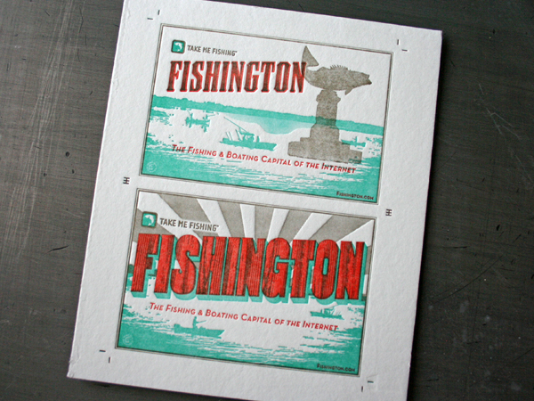
Old travel destination postcards always offer typographic treats. Barrett Haroldson over at Colle McVoy designed some type on these postcards every bit as tasty. We love the mix of haltone texture and overprinting. They are 3/3 letterpress printed on the same press sheet using our big 13 x 18 Heidelberg Windmill running up a stack of 60 point blotter board. That mother turns it out.
I’m no sportsman, but these almost make me want to go fishing. Fishington is great resource to do just that, is spring here yet? And certainly check out Barretts blog.

Published on
February 11, 2009 in
Letterpress.
Tags: 13 x 18 heidelberg, barrett haroldson, blotter board, coaster, colle mcvoy, fishington, halftone, Letterpress, letterpress services, overprint, overprinting, postcard, typography.


