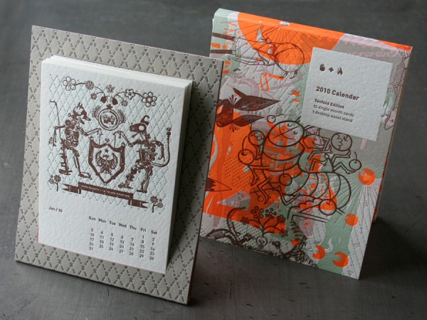
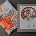
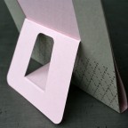
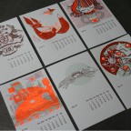
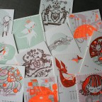
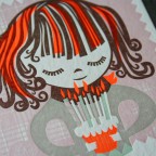
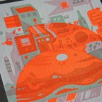
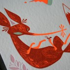
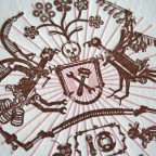
The Studio On Fire 2010 Calendar is now available on our new web site. This calendar is a decade marker for us. Established the end of 1999, Studio On Fire began letterpress printing in a cold Minnesota basement. Our first press occupied a spot between the boiler and the litter box, and oh, how the studio has since grown. Now seven presses strong with a fully equipped studio space, we celebrate ten years as a bustling design and print studio.
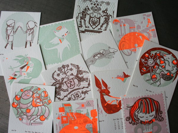
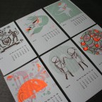
This Tenfold Edition calendar is letterpress printed with four colors on a cotton-blend stock, each month beautifully illustrated by selected designers the world over.
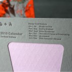
Contributors:
Jan/Jul_ Studio On Fire
Feb/Aug_Cecilie Ellefsen
Mar/Sept_ Brian Gunderson
Apr/Oct_ The Little Friends of Printmaking
May/Nov_ ghostpatrol
Jun/Dec_ Rilla Alexander (Rinzen)


Published on
January 7, 2010 in
Design, Letterpress, News and Studio On Fire Products.
Tags: 2010, Brian Gunderson, brown, calendar, day-glo, Design, easel stand, edition, florescent, ghostpatrol, green, illustration, Letterpress, little friends of printmaking, months, pink, poptone, printing, rinzen, studio on fire, tenfold.
Not that a heart felt email blast or animated web message for the holidays isn’t all well and good, but as you may have guessed we are suckers for a good old fashioned ink on paper. The next few days, we’ll show some previous custom holiday projects we’ve letterpress printed in the hopes of inspiring your own letterpress holiday projects. The holiday card seems to be one of those notorious last minute tasks for creative types. We are already heavily into estimating custom cards for many designers. And as much as we love rushing last minute projects, earlier is always better and leaves many more production options available. Word to the wise, ask us early for an estimate on your project.
…………
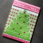
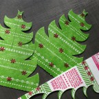
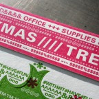
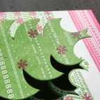
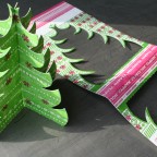
Who says typographic characters don’t make delightful tree ornaments? This card was designed by Katie and Nate over at Eight Hour Day. The green combined with hot pink makes a unique holiday color combo. The card was die cut to produce two parts for a desktop Christmas tree, to be decorated further with objects on your desktop. It was letterpress printed on thick Fox River Blotter stock from Neenah Paper. Since the paper is produced without any surface sizing the blotter sheet has a more mottled appearance in how the textured surface accepts a large solid ink area like the green tree. This gives the printed piece some additional tactile quality. Fa la la la la, ooolala.

Published on
October 28, 2009 in
Holiday and Letterpress.
Tags: blotter, card, cards, christmas, custom, Design, die, die cut, eight hour day, flourescent pink, fox river, green, greeting, heavy, Holiday, Letterpress, neenah, paper, pink, printing, score, tactile, thick, tree, type, typography, unique.

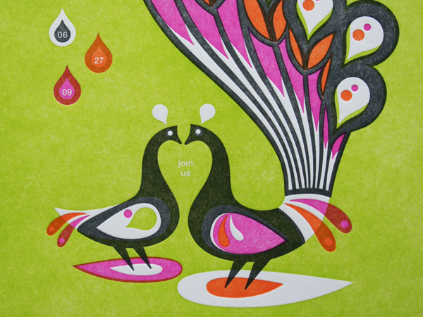
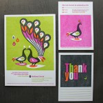
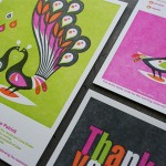
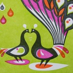
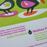
Wedding invitations need not be all typographic. This is a nice change in pace from most invites that tend to focus more on type than image. And we love letterpress printing lots of color, so this artwork does the trick. It was designed by Sheraton Green over at CSA Design. The peacock image comes from the CSA Image collection - an easy $40 bucks to license for wedding invites.
Since CSA also designs all the French Paper stuff, they sent over 140lb Cover Poptone Sweet Tooth paper stock. We printed four PMS colors, with some really beautiful overprinting happening inside the illustration. These kind of solid areas are always a challenge for letterpress. Note how the solid areas are a bit “salty” in the ink coverage.

Published on
April 21, 2009 in
Letterpress.
Tags: art, bird, bright, cards, colors, CSA, Design, feather, french, green, image, invitation, invitations, invite, Letterpress, letterpress services, love bird, minneapolis, minnesota, orange, paper, peacock, pink, printer, printing, spot, thank you, trend, typographic, Wedding.
