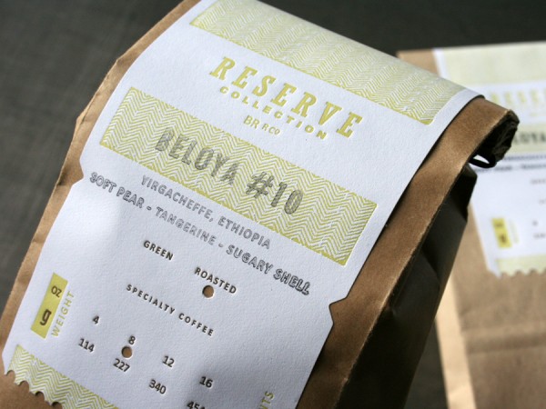
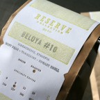
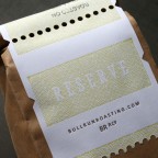
Jeff Holmberg designed these labels for a new line of coffee from Bull Run Roasting Company to be served and sold at their new retail location inside the Rustica Bakery in Minneapolis. Top notch stuff! Bull Run wholesales their coffee into some of the finer restaurants in the metro. This Reserve Collection is the first offering of their coffee at retail and it had to look tasty. The label is customized by rubber stamping the coffee variety and hole punching the bean and weight information. The ripped edge of the label on the kraft bag balances a raw yet refined look. Nice work Jeff.
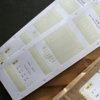
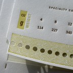
We letterpress printed in two color on Strathmore Ultimate White label stock. We kiss cut the labels with a steel rule die with several punches to add the coarse perforated edge when ripped and opened. Yum and Buzz.

Published on
December 3, 2009 in
Letterpress and labels.
Tags: bag, bakery, beloya, brown, bull run, coffee, collection, Design, edge, holmberg, impression, kraft, label, Letterpress, minneapolis, package, packaging, perf, perforated, perforation, punch, reserve, roast, roasting, rubber stamp, Rustica, strathmore, yellow.
When we posted the Save The Date card by designer Nick Brue a couple months back, we were super excited to see what he had in mind for the design of the actual wedding invitation. Finally, here is his design that just recently left the pressroom:


This invitation set is housed within a mini custom die cut pocket folder which neatly organizes the various cards. The folder is printed with a tonal custom woodgrain pattern using a clear varnish ink on letterpress with heavy impression. A belly band is fitted to the exterior of the folder with a Continue reading ‘Woodgrain & Crest Letterpress Wedding’
Published on
May 8, 2009 in
Letterpress and Wedding.
Tags: band, belly band, brown, buckle, crest, custom, Design, die cut, diecut, folder, invitation, invite, Letterpress, letterpress printing, mini, minneapolis, minnesota, monogram, nick brue, pocket folder, printing, shield, stationery, tiny, tone on tone, type, typography, Wedding, wedding invitation, woodgrain, wrap.


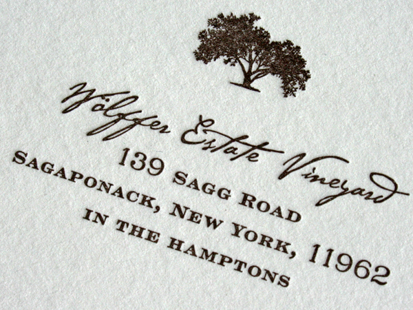
This invitation suite was designed by the bride, Stacey Averbuch. It is an elegant invitation in it’s typographic texture, mixing a coarse script font with a finely serifed engravers typeface. The ink is dark brown letterpress on Crane Lettra cotton paper. A cement green envelope color from French Paper was used for all the envelopes in the set. Email Stacey if you really like the design and would like her to work on a custom stationery set for you.
This a good wedding tip: Colored Envelopes. We like the simplicity of adding color to a wedding invitation set by using a colored envelope. It’s a great way to put some color in the set without the expense of letterpress printing more color.
The same dark brown color is printed on both the cards and the envelopes. We printed the invite cards together on a single press sheet and trimmed them to size after printing. That keeps the cost of all the cards more friendly. Also, don’t forget to include a thank you card while printing your inviations. That saves time and money in the long run. We specialize in printing custom sets brought to us by other designers and event planners. Thanks Stacey for a sharp looking invitation.
Published on
April 30, 2009 in
Letterpress and Wedding.
Tags: brown, color, contrast, cotton, crane, custom, dark, engravers, envelope, estate, french paper, green, hamptons, invitation, invite, Letterpress, lettra, printing, script, serif, texture, tree, typography, vineyard, Wedding.


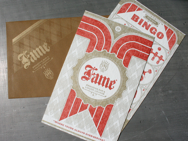
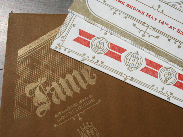
If you aren’t sure what a “meat raffle” is you should really look it up to fully understand the heritage of this design. It’s good to see a fine establishment carry on this noble tradition. Our friends at Fame created this cuss-worthy design for Continue reading ‘Bingo, A Meat Raffle And Letterpress’
Published on
April 19, 2009 in
Letterpress.
Tags: 60, 60pt, a10, bar, beer, board, brown, coaster, dark, darts, Design, dive, envelope, ephemera, Fame, fameretail, foos ball, gold, heavy, ink, invitation, invite, Letterpress, letterpress services, meat, metallic, minneapolis, minnesota, orange, party, point, pulp, raffle, Sam Soulek, sizing, stock, thick, typography, vintage.
Our design friends over at Westwerk have some tremendous attention to detail. Be careful, these images are NSFW. With dense black and custom silver inks printed on heavy 160lb chocolate colored stock, these cards are pretty sexy. That black ink on the dark stock impresses a subtle layer of texture. The silver was toned back with a bit of black mixed in. And the offset printed label wrap with a nice accent color is inset with a die cut and provides the information. Perfect.

Published on
February 15, 2009 in
Letterpress.
Tags: black, brown, Business Cards, custom, details corporate events, die cut, diecut, label, Letterpress, letterpress services, minneapolis, pattern, silver, thick, westwerk.
