Tag Archive for 'show through'

Embossing With Letterpress Print Business Cards

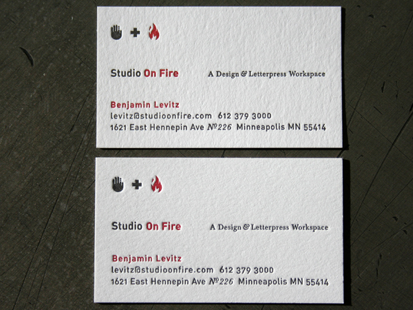
Tactile design can use a lot of different production processes. This card is both blind embossed and letterpress printed. Many people incorrectly use the term “emboss” when speaking about letterpress printing. “Emboss” actually refers to a raised area accomplished by use of a two part die with a form and a counter form. Letterpress printing with heavy impression is closer to a “deboss.” A deboss is pushing down into the paper. (remember “d” for down = deboss) Letterpress plates can use ink but embossing and debossing dies do not use ink. They must be used blind, registered to preprinted artwork or used with foil stamping / blocking.

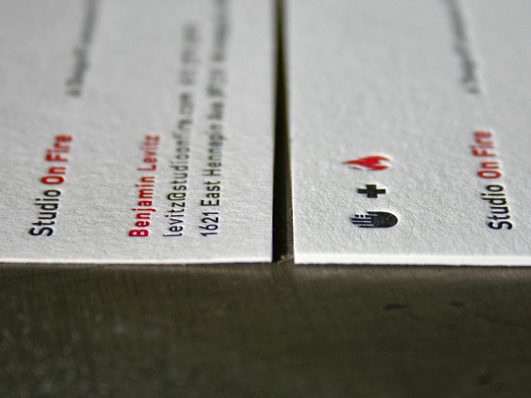
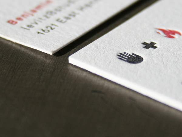
Letterpress equipment can be used for embossing, debossing and letterpress printing, with the correct dies. Unlike embossing and debossing, letterpress plates do not use a form and counter form. A letterpress plate is inked and pressed down into the sheet. See an image below with the polymer plate and its corresponding print and note the difference from the copper embossing die with a white and blue fiberglass counter form that made the circular design embossed on this card. These are two very different types of plates and printing effects, but run on the same Heidelberg windmill press.

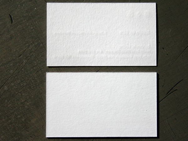
Considering each side of the page is an important design consideration with tactile production processes. With letterpress plates, the amount of bruising or “show through” on the back of the print depends on the amount of pressure applied during printing. However, this definition on the reverse side of the sheet is different on embossing dies because there is a counter form that pushes into the sheet.

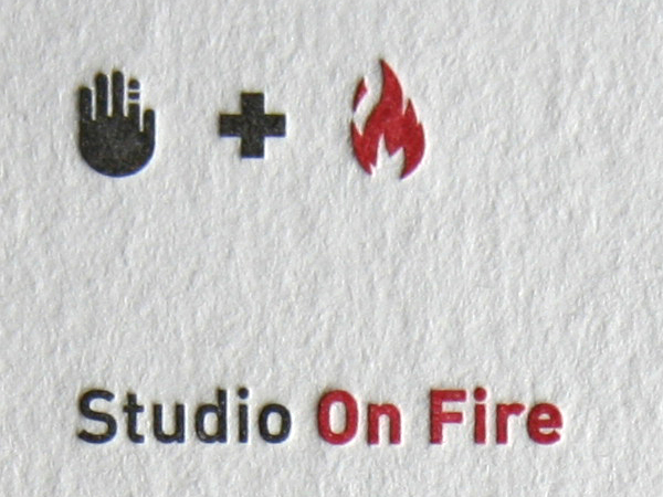
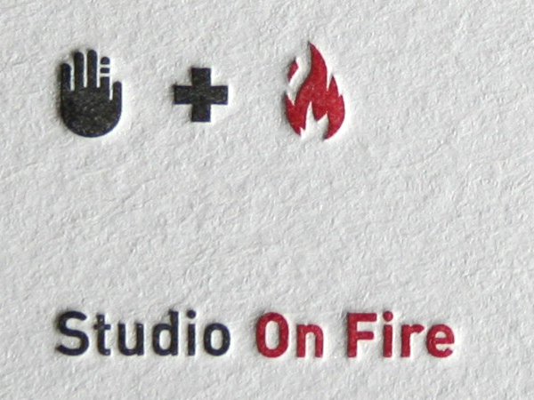
When an emboss is specified there are a few other considerations we would mention. Smaller sized artwork, say 12 point type and smaller offers very little raised definition. Paper thickness is also a concern. We like really thick stocks for letterpress printing, but when embossing that thickness makes it even more difficult to get good definition in smaller details. This paper was 134lb Crane Cover Flo. White, it is 100% cotton and offers a soft and sculptured impression.

Dohmen Letterpress Stationery System

When a design firm gets all the details right, it’s a beautiful thing to print. These business papers for Dohmen were designed by GS design in Milwaukee, and the details are tight. We just finished printing them and thought it was a design well suited for letterpress. The radial dots under heavy impression create a tactile logo, the custom converted rounded envelope flaps echo the logo shape and the edge coloring is a perfect accent on the business cards and folding note card.

The business cards are Neenah Classic Crest Solar White 165lb Cover. They are 2 color letterpress printed with edges colored to match the logo PMS color. Since this was a single sided business card, some impression show through on the back side was not a concern. However, check out the photo of the back side of the business card and you get a visual on what we’d be looking at if there were printing. Printing on both sides with letterpress is possible. Be aware if if deep impression is used, there will be show through from side to side, even on thick stock like 165lb Cover. We can pull back on impression and minimize show through for two sided cards.

The note cards are Neenah Classic Crest Solar White 130lb C - just a little thinner to help get a nice fold.

The letterhead and envelopes are Neenah Classic Crest Solar White 80lb Text. We like the additional weight of an 80lb vs. a 70lb text weight for letterpress printing. It helps everything feel a bit more substantial and does better job with a heavy impression. And the custom converted envelopes are pretty cool - check out the side flaps - they even follow shape of the rounded seal flap. We freak out about stuff like that - nice.

_0007_dohmen_logo_notecard

_0004_dohmen_stationery_system2

Comparing Thick and Thicker Paper

We love thick stocks. It is a friend with benefits. One of the challenges in letterpress printing is working with the “show through” of the impression to the opposite side of the page. When you have a thicker stock it becomes easier to show more impression and have less show through.

These pictures compare 110lb Cover (300gsm) with 220lb Cover (600 gsm) Crane Lettra which is 100% cotton. What you should notice is that they both have a sculptural impression. But the thinner stock on the top does have some show through, while the thicker stock below has even more impression and no showing on the opposite side. That becomes important if you are doing a two sided business card and wish to minimize showing. The depth of impression on letterpress is controled by varying the amount of packing material underneath the sheet being printed. A single sided design is easier to achieve heavy impression because there isn’t as much worry about the back of the paper.