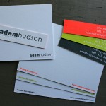
These business cards are elegant and simple with an unusual format. Although the feel of the design is traditional, the 4.25 x 1.25 inch size presents as an untraditional business card size. The client, William and Mary, makes premium gift wrap collections, so the paper crafting of the printing was very important.
These cards were letterpress printed with 2 ink colors on each side. The cards also have a heavy blind letterpress impression graphic on both sides. This blind area overlaps type on the reverse side. To get an even type appearance and a heavy sculptural impression on both sides we printed a 110lb sheet of Crane Lettra Fluorescent White and pasted it together back to back after printing. By duplexing the stock to a thick 220lb weight after printing the impression show through is eliminated. It is a time consuming and more premium production step, worth it for the final look of these cards. The final step was a round corner die cut.

Published on
June 30, 2010 in
Business Cards and Letterpress.
Tags: 110lb, 220lb, blind, Business Cards, classic, corner, crane, die cut, diecut, duplex, elegant, flo white, flourescent, glue, heavy, impression, Letterpress, lettra, long, narrow, paste, pasting, potdevin, round, slim, traditional, type, typography, unique size.
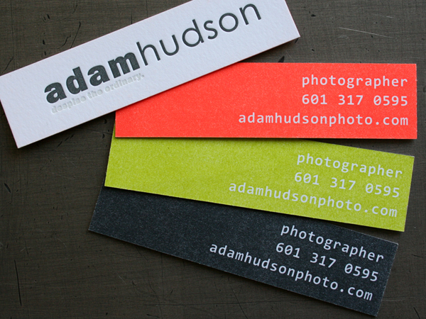
Adam Hudson Photo sent us these cards for letterpress printing. The unique narrow format really make them different in your hand. And the three color options of orange, green and gray on one side is a nice way to add some simple variety to an identity piece. We keep the plate set up on press and just add a couple wash ups to the printing process.
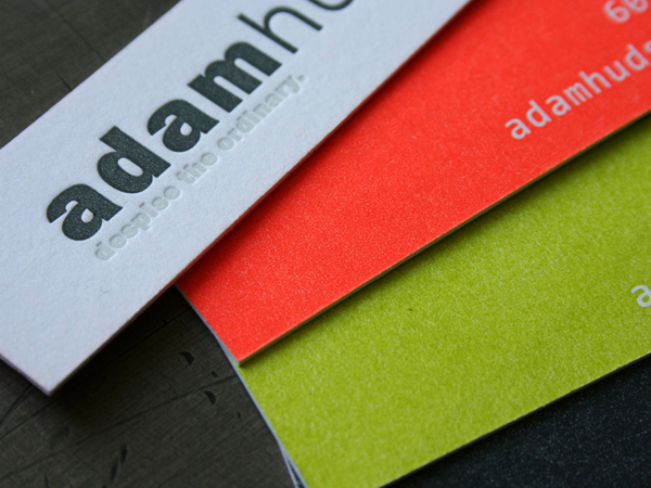
A thick 220lb cotton stock takes a beefy impression. When a two sided card is pressed with a solid color, we almost always print the solid side first, then the text. This makes for a better sculptural impression on a text only side. Putting an overall impression on a solid area has the effect of ironing the paper flat and will diminish any impression of artwork on the reverse.
Another ink effect we like on this card is the white ink on white paper. We are using a tinted white ink to create a nice subtle detail with just the right amount of contrast to keep it readable. Some times an inkless (blind) impression doesn’t have quite enough visibility to read clearly. We put a little bit of silver in the white ink to give it just the right amount of eye love.


Published on
April 22, 2009 in
Letterpress.
Tags: 220, adam, blind, business, card, cards, cotton, day, glo, gray, green, hudson, impression, ink, inkless, Letterpress, narrow, opaque, orange, photo, photographer, photography, solid, tinted, white.


