Erin Jang designed this custom wedding project for Marci and Ben with a unique combination of letterpress and digital printing. The typography here really has a beautiful touch - even with lots of different typefaces, the design is balanced and elegant. Not always an easy thing to do. We also like how the mini envelope on the invitation card creates another level suspense in opening the invitation.
We printed the letterpress portion of the project with 220lb Crane Lettra in an Ecru color and returned them to Erin for finishing. (They needed them quickly, and yes we are always doing some sort of rush custom letterpress work) These cards then had a unique small envelope afixed to them which contains the digitally printed red invitation. Also worth a produciton note is the perf that separates the map and the rsvp card into two parts. We used a fairly coarse perforating rule - about 20 tpi. (teeth per inch) A very thick stock needs enough paper left intact on the perf so it doesn’t just accidently fall off. It’s always worth having several kinds of perf rule around to test the stock and use the one that works best. The difference between a perf that just won’t tear clean and one that falls apart to easy can be tricky to balance. We keep rule around from around 18 tpi up to 100 tpi micro perf.
Check out Erin Jangs blog for more sweet design work. And if you want more, this invite has also been bloggity blogged on some of our favorite sites including Design Sponge, Black Eiffel and Mint Design Blog.


Published on
August 12, 2009 in
Letterpress and wedding.
Tags: 220lb, cotton, crane, custom, Design, designer, ecru, envelope, erin jang, gray, invitation, invitations, invite, Letterpress, lettra, mini, perf, perforation, printer, printing, red, script, stationary, stationery, tpi, type, typography, wedding.


We figured we’ll keep going with the wedding invitation posts all this week.
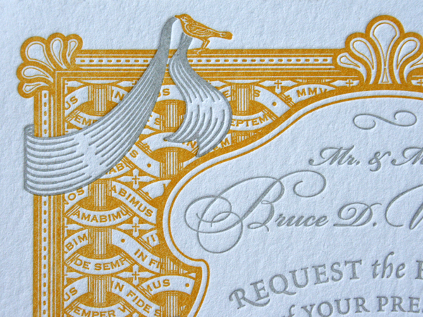
This letterpress invitation is an exquisite balance of wickerwork ornament and type. The graphic ribbon creates a wonderful sense of dimension as it intertwines the ornamental panels. The script font combines with the serif and italic fonts to establish a Continue reading ‘Ornamental Wickerwork: Carolina Wedding Invitation’
Published on
May 5, 2009 in
Letterpress and wedding.
Tags: bird, brooke, cards, carolina, cleve, crane, Design, fonts, gray, invitation, invite, Letterpress, lettra, minneapolis, minnesota, north, ornament, ornamental, printer, printing, ribbon, rococo, script, serif, shell, smith, stationery, type, typography, wagoner, wedding, wicker, wickerwork, yellow.
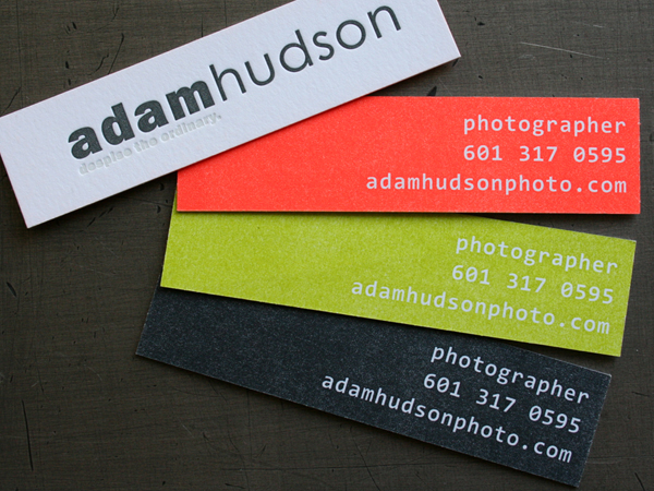
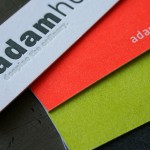
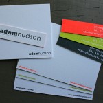
Adam Hudson Photo sent us these cards for letterpress printing. The unique narrow format really make them different in your hand. And the three color options of orange, green and gray on one side is a nice way to add some simple variety to an identity piece. We keep the plate set up on press and just add a couple wash ups to the printing process.
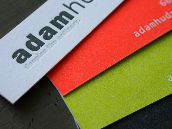
A thick 220lb cotton stock takes a beefy impression. When a two sided card is pressed with a solid color, we almost always print the solid side first, then the text. This makes for a better sculptural impression on a text only side. Putting an overall impression on a solid area has the effect of ironing the paper flat and will diminish any impression of artwork on the reverse.
Another ink effect we like on this card is the white ink on white paper. We are using a tinted white ink to create a nice subtle detail with just the right amount of contrast to keep it readable. Some times an inkless (blind) impression doesn’t have quite enough visibility to read clearly. We put a little bit of silver in the white ink to give it just the right amount of eye love.


Published on
April 22, 2009 in
Letterpress.
Tags: 220, adam, blind, business, card, cards, cotton, day, glo, gray, green, hudson, impression, ink, inkless, Letterpress, narrow, opaque, orange, photo, photographer, photography, solid, tinted, white.


