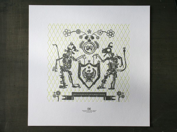
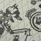
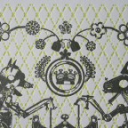
This is our letterpress poster for the Toys In The Attic show opening at the Soo Visual Arts Center on Dec 4th from 6 to 9PM. The show features both custom toys and toy inspired posters. Proceeds benefit Toys For Tots. Hey, that’s tomorrow night! We hope to see you there.
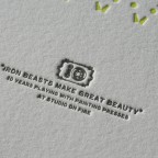
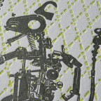
These beasts are in fact our toys. The graphic beasts are constructed from various press parts and form into a crest that commemorates ten years of printing here at Studio On Fire. The dog latin phrase reads “Iron Beasts Make Great Beauty”. It is printed in fluorescent and dark silver inks on Crane Lettra Flo White 220lbC at 13 x 13 size.
It was ten years ago this month back in 1999 that the first C&P was lowered into the then basement studio. More to come on our own ten year anniversary party soon.

Published on
December 3, 2009 in
Design, Letterpress, News and Posters.
Tags: 220lb, beast, crane, crest, Design, edition, fluorescent, ink, iron, Letterpress, lettra, minneapolis, poster, press parts, print, printer, silver, soo, soo visual arts center, soovac, studio on fire, ten years, toys for tots, toys in the attic, unique.
This simple one color wedding invitation was designed by the groom for the couples December wedding in Kyoto, Japan. The head silhouettes have a unique anime / manga style. We also love the modern graphic crest containing the interlocking rings and the matrimony announcement. It’s a bold yet refined design - traditional subject with a modern presentation. Nice work Osamu!
The cards were layed out together on a large 13 x 18 Flo White Crane Lettra 110lbC press sheet. These were printed on our Vandercook Uni III. We letterpress printed two passes of the gold ink for better ink density . Here’s something to keep in mind when running a double pass on a cylinder press - don’t adjust the packing on the press between pass one and two. By adjusting the packing, you also change the circumference of the cylinder, making it very difficult to register the second pass. We like to run two passes of ink metallics to give a little better sheen. Metallic ink, especially on an uncoated cotton stock will never be shiny like a coated stock or approach the mirror finish of a foil stamp, but it is crisp in details and does offer a small amount of shine.


Published on
October 6, 2009 in
Letterpress and Wedding.
Tags: 1 color, 110lbC, anime, cards, crane, crest, custom, cylinder press, Design, graphic, invitation, invitations, invite, japan, japanese, kyoto, Letterpress, lettra, manga, modern, one color, silhouette, stationery, uni iii, unique, vandercook, Wedding.
When we posted the Save The Date card by designer Nick Brue a couple months back, we were super excited to see what he had in mind for the design of the actual wedding invitation. Finally, here is his design that just recently left the pressroom:


This invitation set is housed within a mini custom die cut pocket folder which neatly organizes the various cards. The folder is printed with a tonal custom woodgrain pattern using a clear varnish ink on letterpress with heavy impression. A belly band is fitted to the exterior of the folder with a Continue reading ‘Woodgrain & Crest Letterpress Wedding’
Published on
May 8, 2009 in
Letterpress and Wedding.
Tags: band, belly band, brown, buckle, crest, custom, Design, die cut, diecut, folder, invitation, invite, Letterpress, letterpress printing, mini, minneapolis, minnesota, monogram, nick brue, pocket folder, printing, shield, stationery, tiny, tone on tone, type, typography, Wedding, wedding invitation, woodgrain, wrap.
