Erin Jang designed this custom wedding project for Marci and Ben with a unique combination of letterpress and digital printing. The typography here really has a beautiful touch - even with lots of different typefaces, the design is balanced and elegant. Not always an easy thing to do. We also like how the mini envelope on the invitation card creates another level suspense in opening the invitation.
We printed the letterpress portion of the project with 220lb Crane Lettra in an Ecru color and returned them to Erin for finishing. (They needed them quickly, and yes we are always doing some sort of rush custom letterpress work) These cards then had a unique small envelope afixed to them which contains the digitally printed red invitation. Also worth a produciton note is the perf that separates the map and the rsvp card into two parts. We used a fairly coarse perforating rule - about 20 tpi. (teeth per inch) A very thick stock needs enough paper left intact on the perf so it doesn’t just accidently fall off. It’s always worth having several kinds of perf rule around to test the stock and use the one that works best. The difference between a perf that just won’t tear clean and one that falls apart to easy can be tricky to balance. We keep rule around from around 18 tpi up to 100 tpi micro perf.
Check out Erin Jangs blog for more sweet design work. And if you want more, this invite has also been bloggity blogged on some of our favorite sites including Design Sponge, Black Eiffel and Mint Design Blog.


Published on
August 12, 2009 in
Letterpress and wedding.
Tags: 220lb, cotton, crane, custom, Design, designer, ecru, envelope, erin jang, gray, invitation, invitations, invite, Letterpress, lettra, mini, perf, perforation, printer, printing, red, script, stationary, stationery, tpi, type, typography, wedding.
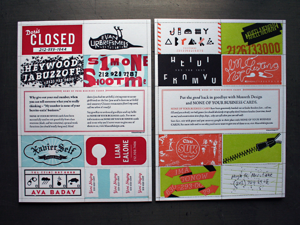
Here’s a sweet little run we just finished up for Mauseth Design out of Hoboken, New Jersey. They came up with this set of faux business cards with fake names and numbers for those certain instances where you just- well, where you just could use one of these little guys (e.g. Clubs, Bars, Lounges, Coffee Shops, Class Reunions, Chinese Restaurants and Traffic Stops).

Published on
July 21, 2009 in
Client Focus, Letterpress and News.
Tags: 130lb Manadanack astrolite PC 100, business cards, funny, illustration, Letterpress, perf, perforated, post consumer, recycled, three color.
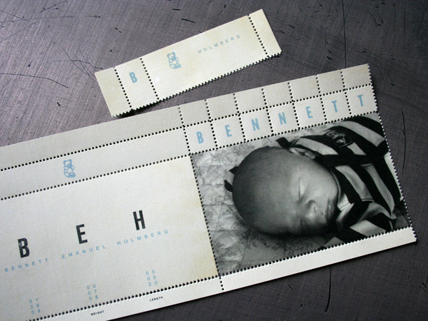
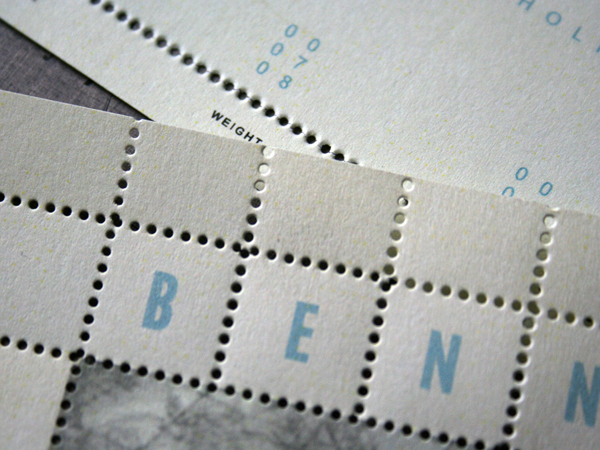
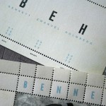
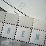
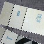
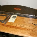
Ok, this is not letterpress. But it is another one of those crazy little production services we can do that adds some vintage style texture. This is called pinhole perforation. We’ve also heard it referred to as rathole perforation. It is different from standard perforation in that it not only cuts the sheet, it actually removes a paper dot like an old school sheet of postage stamps. It works best on thinner stocks, but can work on card stock as well. This card is digitally printed on a dry gum stock. (lick and stick paper with re-moist adhesive on the back)
Jeff at Holmberg Design is great at using layers of texture in his projects and really working the production details. He designed these for their new arrival. We wish them the very best.


Published on
February 16, 2009 in
Letterpress.
Tags: baby announcement, birth, card, dry gum, holmberg design, jeff holmberg, label, Letterpress, letterpress services, minneapolis, perf, perforation, perforator, pinhole, postage, rathole, sheets, stamp.


