
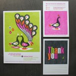
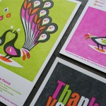
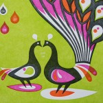
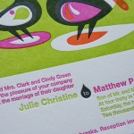
Wedding invitations need not be all typographic. This is a nice change in pace from most invites that tend to focus more on type than image. And we love letterpress printing lots of color, so this artwork does the trick. It was designed by Sheraton Green over at CSA Design. The peacock image comes from the CSA Image collection - an easy $40 bucks to license for wedding invites.
Since CSA also designs all the French Paper stuff, they sent over 140lb Cover Poptone Sweet Tooth paper stock. We printed four PMS colors, with some really beautiful overprinting happening inside the illustration. These kind of solid areas are always a challenge for letterpress. Note how the solid areas are a bit “salty” in the ink coverage.


6 Comments
These are gorgeous! I’ve never seen wedding invitations like this. Makes me wish I could get married again just so I could use these.
Very cool!
I hope this is okay and if not- let me know & I’ll remove it http://gekd.wordpress.com/2009/04/22/inspiration-tracking-studio-on-fire/
Thanks for such kind words!
Beautiful! I hope the wedding is, too. And the marriage :)
Studio On Fire has put out the most unique and awesome wedding invites I have ever seen! You are my most coveted competition :)
I am truly in love with these peacocks.
2 Trackbacks
[...] by Sheraton Green from CSA Design, immediately caught my eye. Would you guess that these are wedding invitations? Oh, to be invited to this wedding and receive one of these [...]
[...] loves Birds Of A Feather, Letterpressed Together – Yes, this is another letterpress blog. But this time with a twist. Color. And lots of it. Bright colors have really been catching my eye [...]