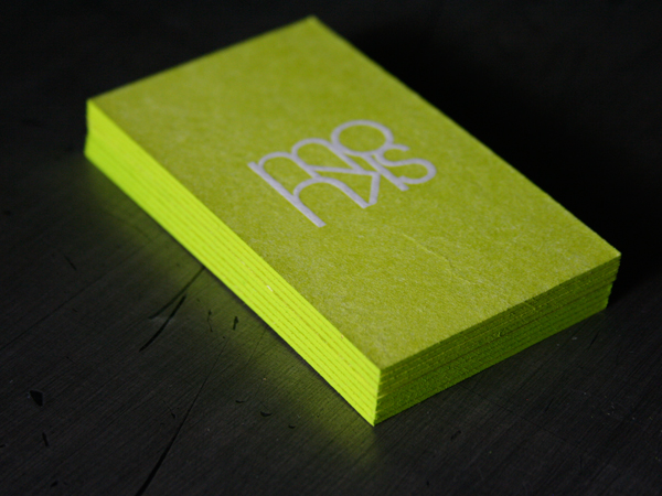
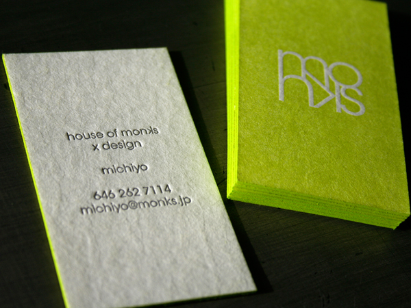
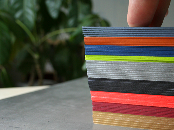
We turn some tricks in addition to letterpress and design. This little production trick may cause a full-on business card fondling session. We call it edge tipping, edge painting, edge coloring. We use the process to color the edges of cards, books, journals, notepads - anything with a thickness can be colored. Any Pantone color, including metallics, can be specified. For single cards we recommend stock of 160lb and up. We do this after printing and trimming the stock to size.
House of Monks is one of our favorite cards using this process. Her design takes the color printed on the face of the card and matches that same color on the edge. So simple and modern, we call that sweeeet.


7 Comments
Great! Is really cool once you realize is not colored paper :P
Hopefully the potential clients will appreciate it too.
Do you do this with the same oil/rubber ink as the print job, or do you mix a paint, say acrylic, to match the job?
No, ink does not work too well, we use a paint.
fantastic colors !
Love the edge printing.
could you tell me what stock and weight was used for the ‘house of monk’ examples, please?
i am guessing at 600gsm crane lettra :)