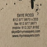
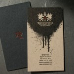
These guys are certainly one of the hottest Minneapolis record labels. Rhymesayers Entertainment sent us this business card design for a raw and painted letterpress look.
Production turned out sweet, but it has some letterpress challenges.
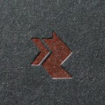
Colored Metallic Ink on Black Stock
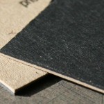
This card is printed on a custom duplexed paper - French Construction Black glued to French Speckletone. On the black side we printed a red metallic ink. Metallic ink colors on in letterpress or offset printing are opaque BUT as color pigment such as red is added the ink becomes more transparent. The look is more subtle than a foil stamp.
Large Ink Area with Small Type Reversing Out
In modern letterpress application, clients want to see impression. As a general rule, reversing small type out of a larger graphic is not the best use of letterpress. The type is not getting “impressed” - the graphic around the type is. So, if you are looking for letterpress impression with your text, don’t reverse out of a field of color. Note how the small information text and the logo on the black side of the card have more visible impression than the logo inside the spatter mark.
An additional challenge with a large area of ink coverage becomes holding onto small detail within the graphic and running the ink heavy enough for good dense coverage. On this card, the raw and heavy ink was desirable, the look is a like a heavy paint on chipboard. You can see how the heavy ink begins to “squeeze” a bit on both the logo and the information type. Sometime to get crisp type we can run a large graphic separate from small text even though they may be the same ink color. This allows us to run a heavier film of ink for the graphic and get solid coverage, then run a lighter film of ink for the text and get crisp type. However, that does mean an additional set up and press run.


6 Comments
Pretty hot dudes. This is what I like to see. Nice work.
Nice work.
Awesome post — I’ve got quite a few well-played albums from Rhymesayers. It’s nice to see the stuff that I most likely wouldn’t otherwise. Love the production notes too. Informative, as always guys.
Awesome post — I’ve got quite a few well-played albums from Rhymesayers. It’s nice to see the stuff that I most likely wouldn’t otherwise. Love the production notes too. Informative, as always guys.
Sorry, should have added great post! Waiting on your next one!
Great work. I love the descriptions of how it all comes together. You are great teachers.
Sick! I love how much work and creativity gets put into cards you guys work on.
Rhymesayers is an awesome label too. They make quality music in a world filled with crap.
Amazing detail!!