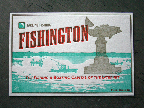
Old travel destination postcards always offer typographic treats. Barrett Haroldson over at Colle McVoy designed some type on these postcards every bit as tasty. We love the mix of haltone texture and overprinting. They are 3/3 letterpress printed on the same press sheet using our big 13 x 18 Heidelberg Windmill running up a stack of 60 point blotter board. That mother turns it out.
I’m no sportsman, but these almost make me want to go fishing. Fishington is great resource to do just that, is spring here yet? And certainly check out Barretts blog.


6 Comments
awesome overlay!
do you use dental damn for halftones on the 13×18?
Thanks!
No, we do not use dental dam. With a soft heavy stock like a blotter sheet it is more about having finely tuned roller height and a good even film of ink. Otherwise the artwork starts to gain and fill in.
awesome thanks
Hi StudioOnFire,
(sorry for my bad english, i’m french ;) )
I would like to tell you: your work is really awesome. Your jobs are really very well finished. it is a good lesson for all, sincerely thank you.
Continue your blog, it is marvellous to see this working type.
Good continuance.
I post a new selection of your amazing prints on http://www.graphic-exchange.com . The new top image is much much better ;) Take care.
Thanks Fabien! Nice to see the updated page on your site. Take care.