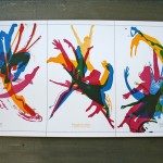
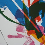
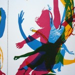
This design poetry is from Jeff Johnson and the esteemed crew at Spunk Design Machine in Minneapolis, done for the Univeristy of Minnesota. They have a keen sense of design experimentation and always seem to keep things playful. For this poster, there are only three ink colors printed but the beauty of overprinting those colors really creates some dimension in the artwork. The art work is a mix of vector and raster. You can see the detail shots of the halftone images, they are pretty course line screens. The final poster is pinhole perforated into a three parts giving the whole piece a sweet little bit of texture.


4 Comments
This is absolutely beautiful! The overprinting really creates some nice color and texture. I also appreciate the subtleties like the perforation! Keep up the amazing work and thanks for all the project details as well. Those are quite interesting bits of info.
Really nicely done.
The three colors mix and make even more colors, brilliant. Love the dimension too.
This is amazing - great work. Kudos to you and the Spunk Design Machine.
it’s amazing, of course. i am in LOVE with overlapped letterpress colors.
One Trackback
[...] Check out other pics here. [...]