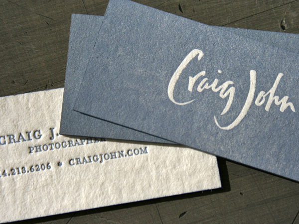
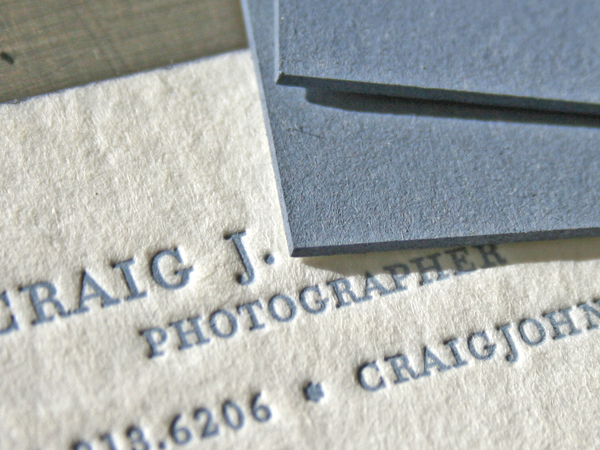
Wedding photographer Craig J.Stodola wanted a card with a memorable thump factor. This one is printed on 60pt blotter. And take a look at the edge coloring. After we printed a Pantone color, we color matched the edges to the face of the card.
Blogs
- Allan Peters
- Booooooom
- CMYKern
- Computer Love
- Dirty Mouse
- Draplin Design Co.
- FFFFound
- FormFiftyFive
- Grain Edit
- It’s Nice That
- Joy Engine
- Micah Barrett
- Ntnl. Geographic News
- Quipsologies
- So Much Pileup
- The Pressure
- Viewers Like You
Friends
- Adam Garcia
- Aesthetic Apparatus
- Crystal Barlow
- Eight Hour Day
- Gunderson Jacobs
- Harmen Liemburg
- Rinzen
Studio
-
Categories
-
Archives
-
Meta


5 Comments
Wow, that’s a phone book!
What typeface is that (the handwritten one)?
Hand lettering is custom.
Can I ask how you matched the color on the edges? Sadly, my first thought was a marker and a lot of hand-bindery work.
Nice work, I love the thick board and coloured edges reminds me of the old photographic studio cards which are always on very thick board and have beautiful gold edges.
It is hand bindery work, but we can color stacks at a time. We did a corporate order of 50,000 cards with edge matched color, so it moves quickly once we get set up. We can do metallic edges too, but it is not a foil edge like a bible. Foil blocking is something we are trying to learn. Let me know if you know how, I’d love to talk.
One Trackback
[...] Studio On Fire // Design & Letterpress Blog Seriously Thick Business Cards! [...]